Art that unites the past, present & future.
“Beautiful work. I have his Springsteen. Printing quality is exceptional. Feels like a hand drawn charcoal sketch. Not sure how he does it, but super cool.” - Mark G.
Music Posters
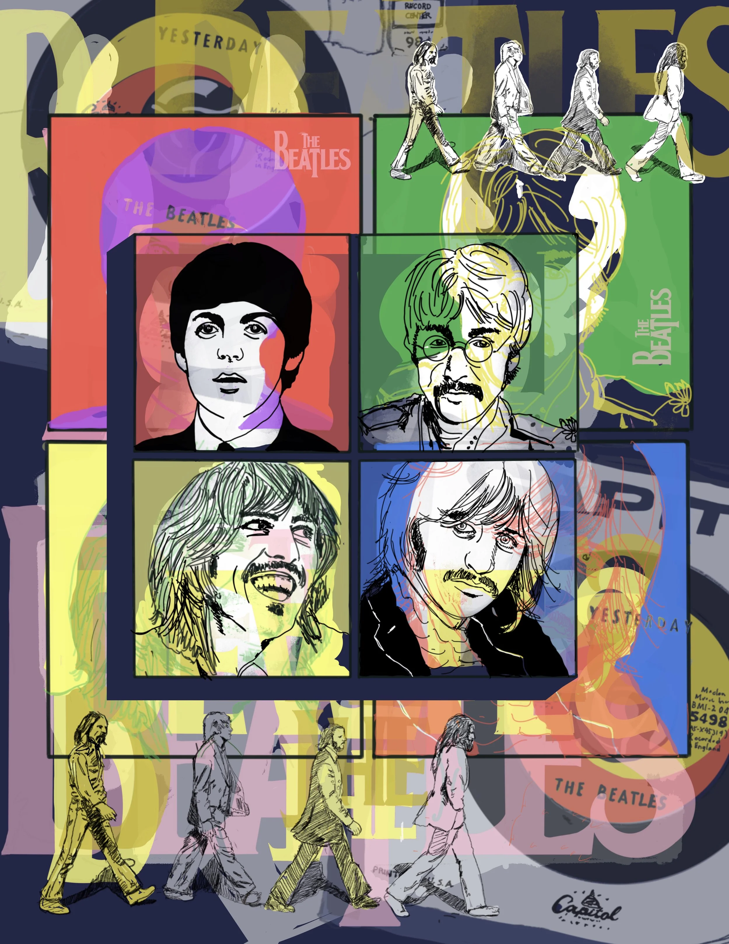
Four faces that established the idea of a band as an image, and then a brand, and not just a sound. This one was less about picking a favorite era and more about finding the line work that could hold all four of them together without flattening any one of them out. Some subjects earn the "icon" label just by existing — this is one of them.
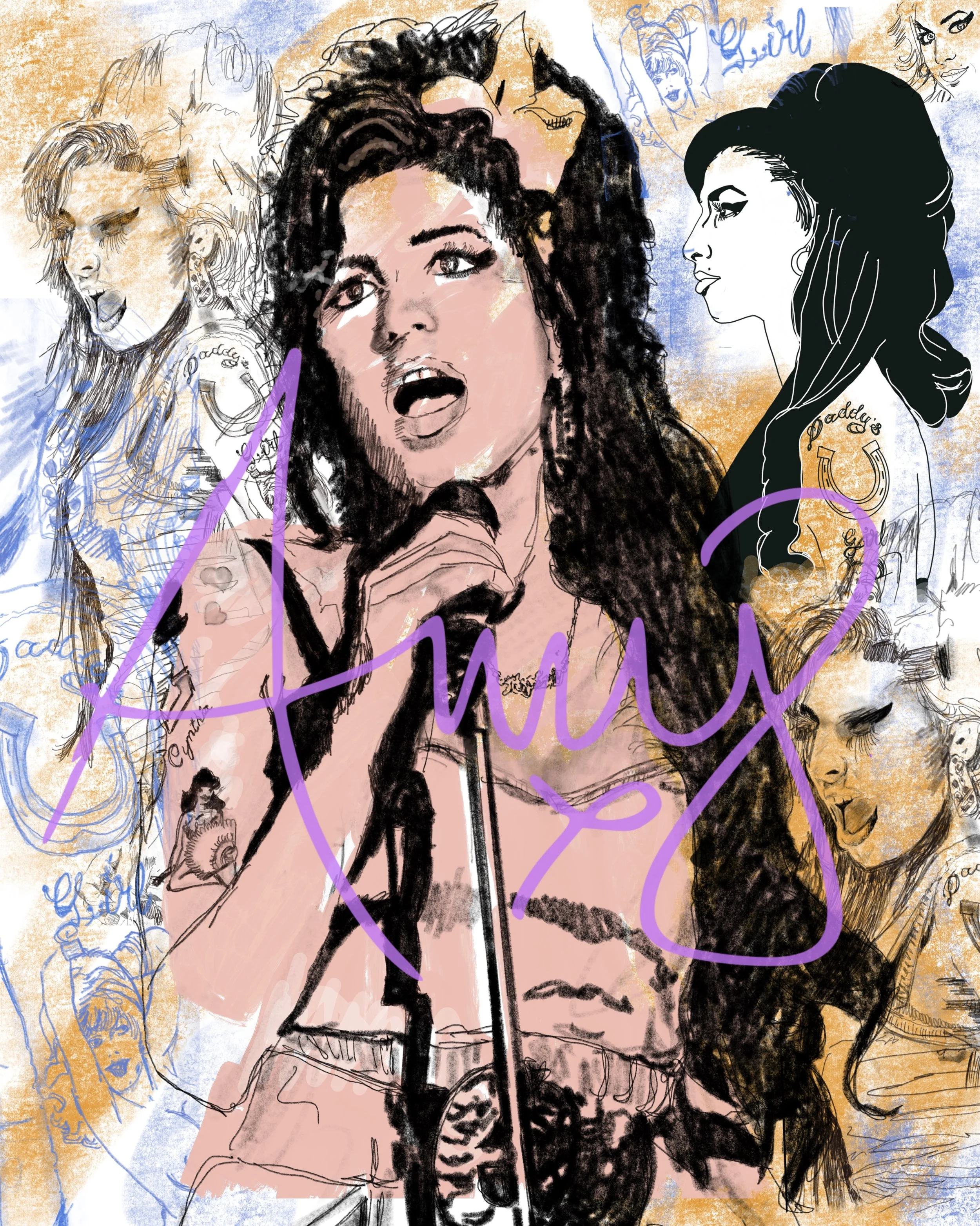
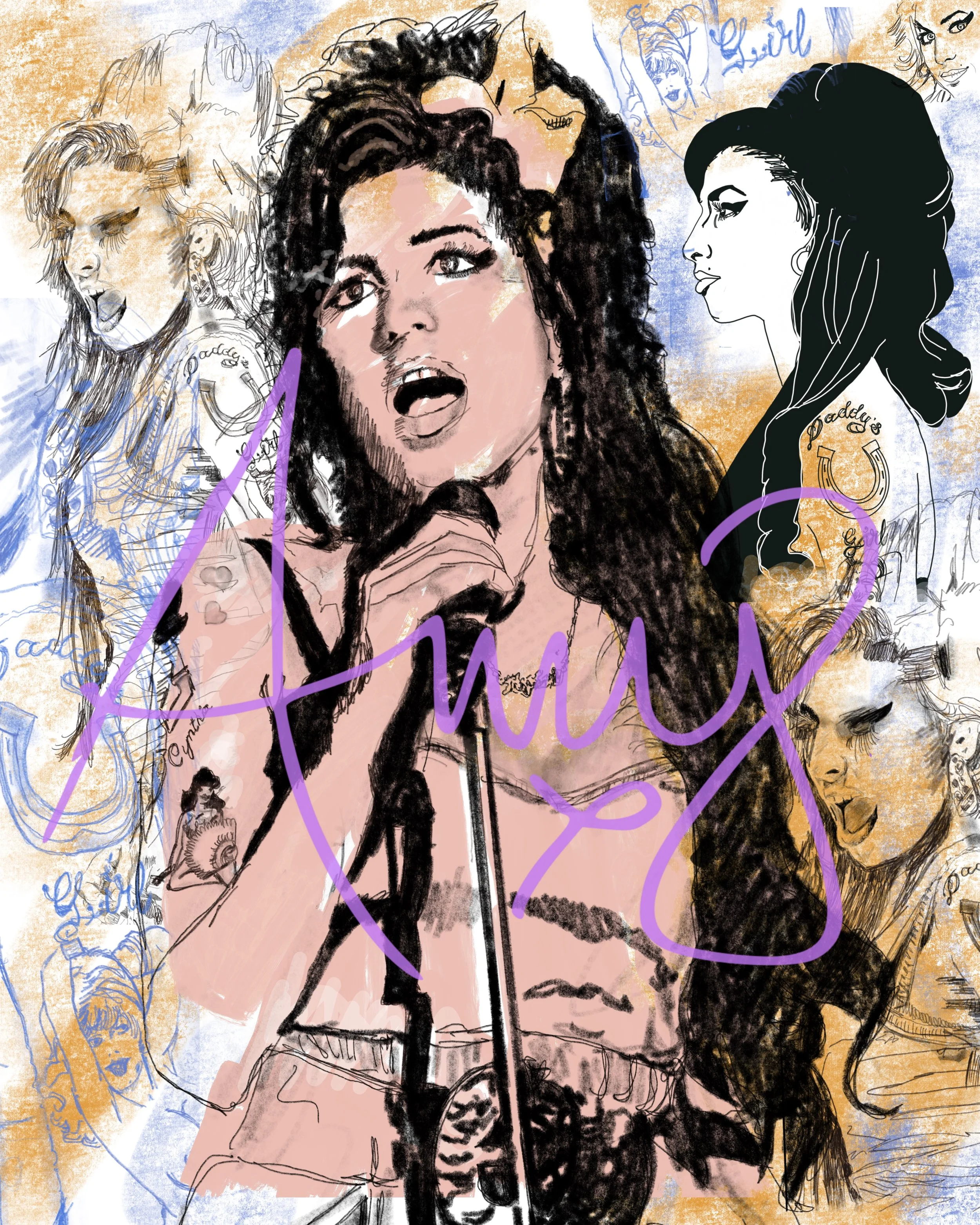
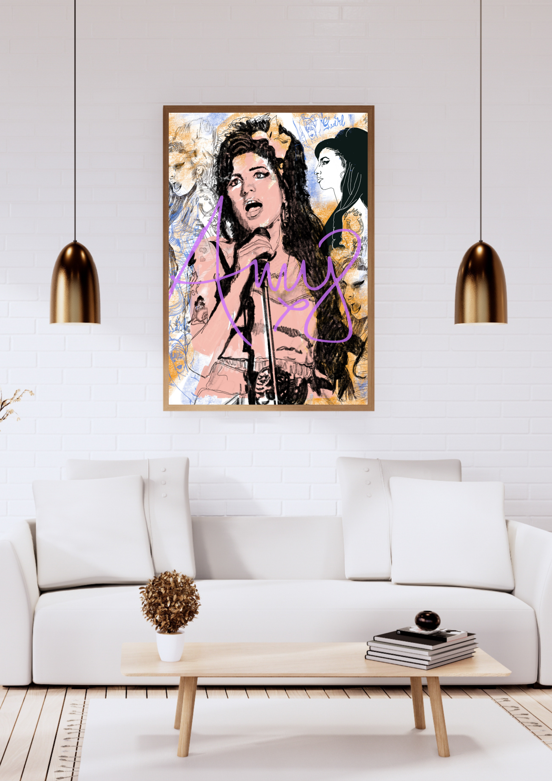
Some artists carry so much weight that the art around them must get out of the way. This is one one of my favorites, both artists and poster. I was very intentional about bringing out a sense of authenticity. I allowed her tattoos to add a narrative element to the story the reflected the simplicity of the art. Not because there wasn't more to say, but because sometimes the quietest version of a piece is the most honest one.
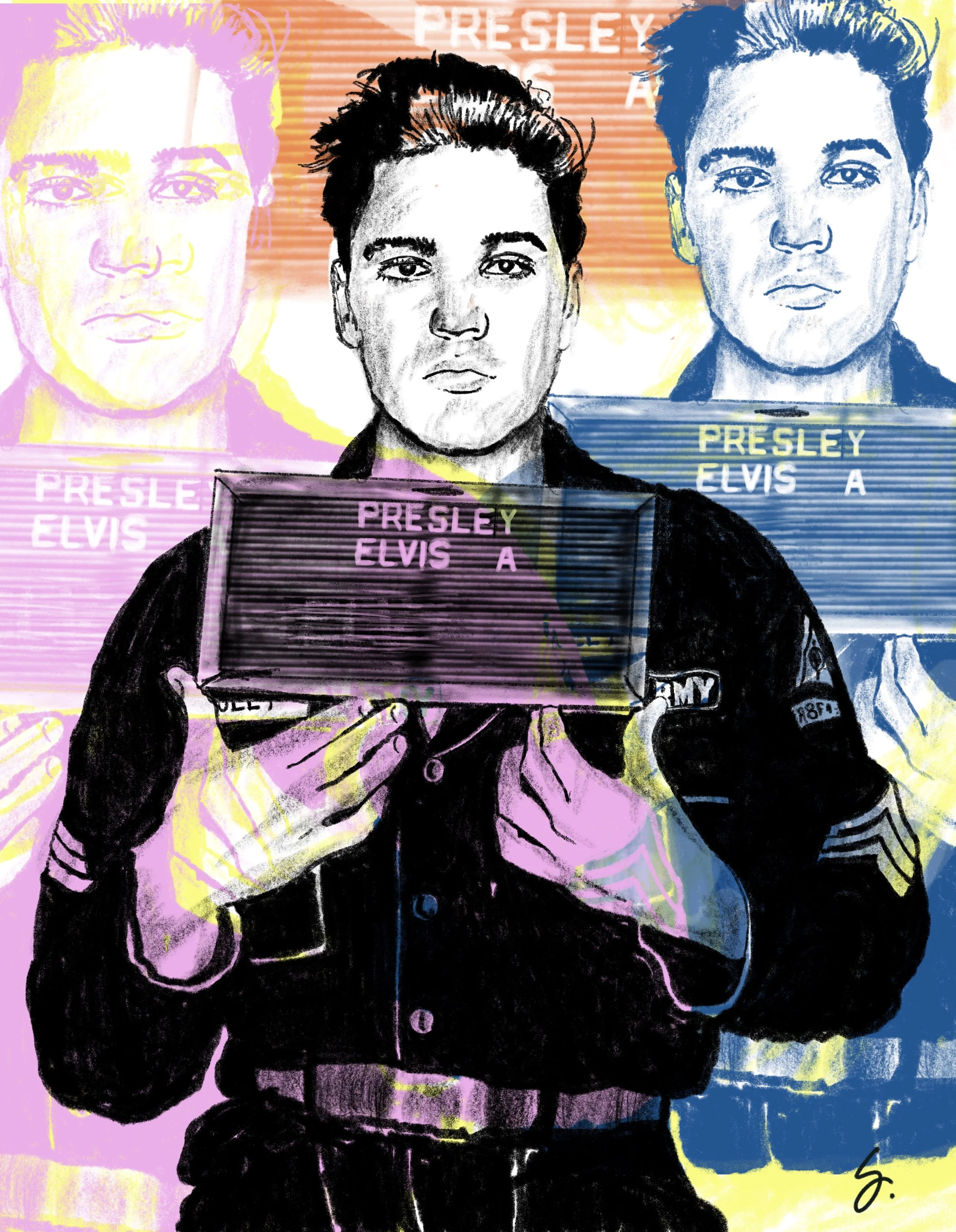
It’s easy to find versions of Elvis that are pure spectacle, and others reminding us he’s just a kid from Tupelo who could sing. I tried to split the difference — enough shine to earn the "King" title, enough restraint to remember there was a person behind it all.
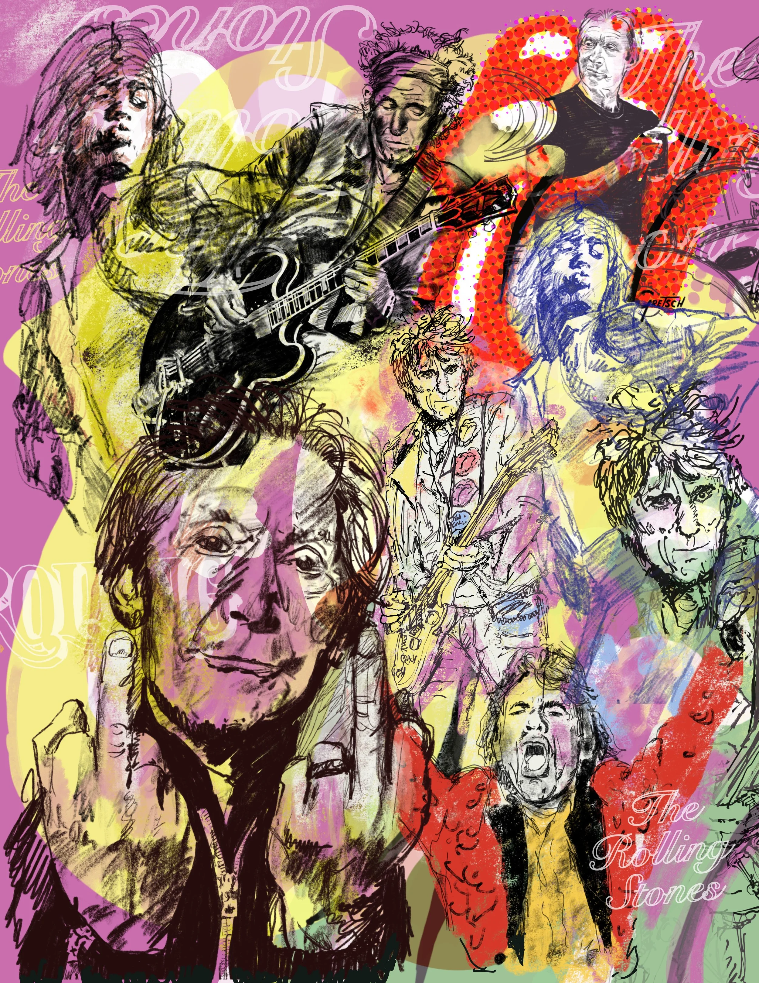
Longevity is its own kind of story. Most bands don't get a fifth act, let alone a sixth or seventh. One first glance, this is a busy piece, but I wanted to represent the energy of their longevity, and sure this piece was less of a portrait of a moment in time, and more a portrait of a band that refused to become a museum piece.
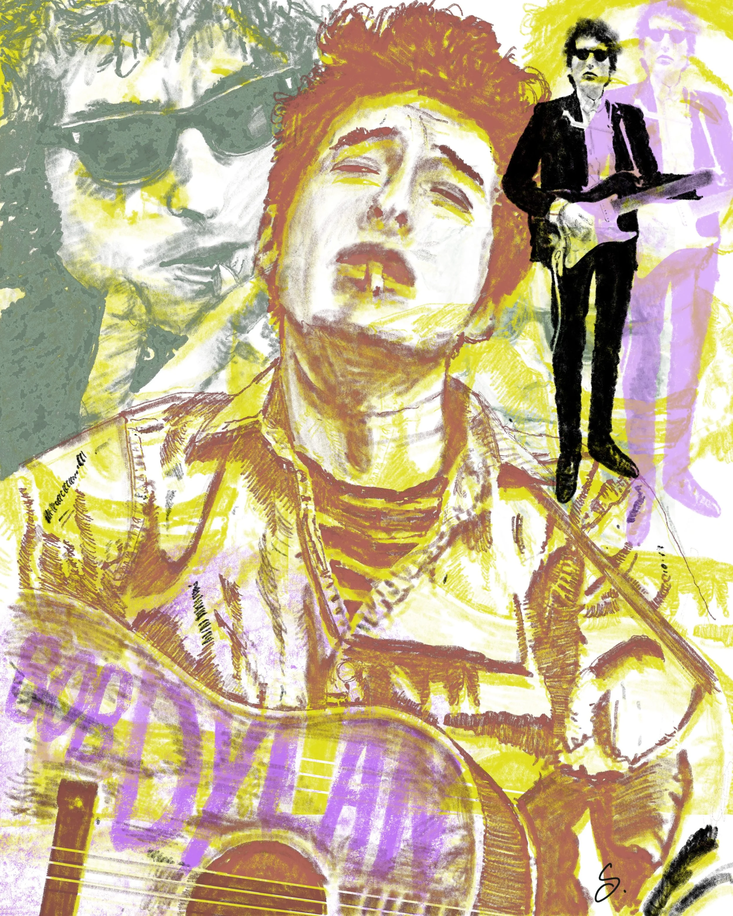
When you think of music icons, Bob Dylan certainly tops the list. Influencing generation after generations, in different ways, his songs are covered by gospel groups, jazz singers, classical artists and that’s before we get to all the people sitting in their bedrooms learning how to the play Blowin’ in the Wind.
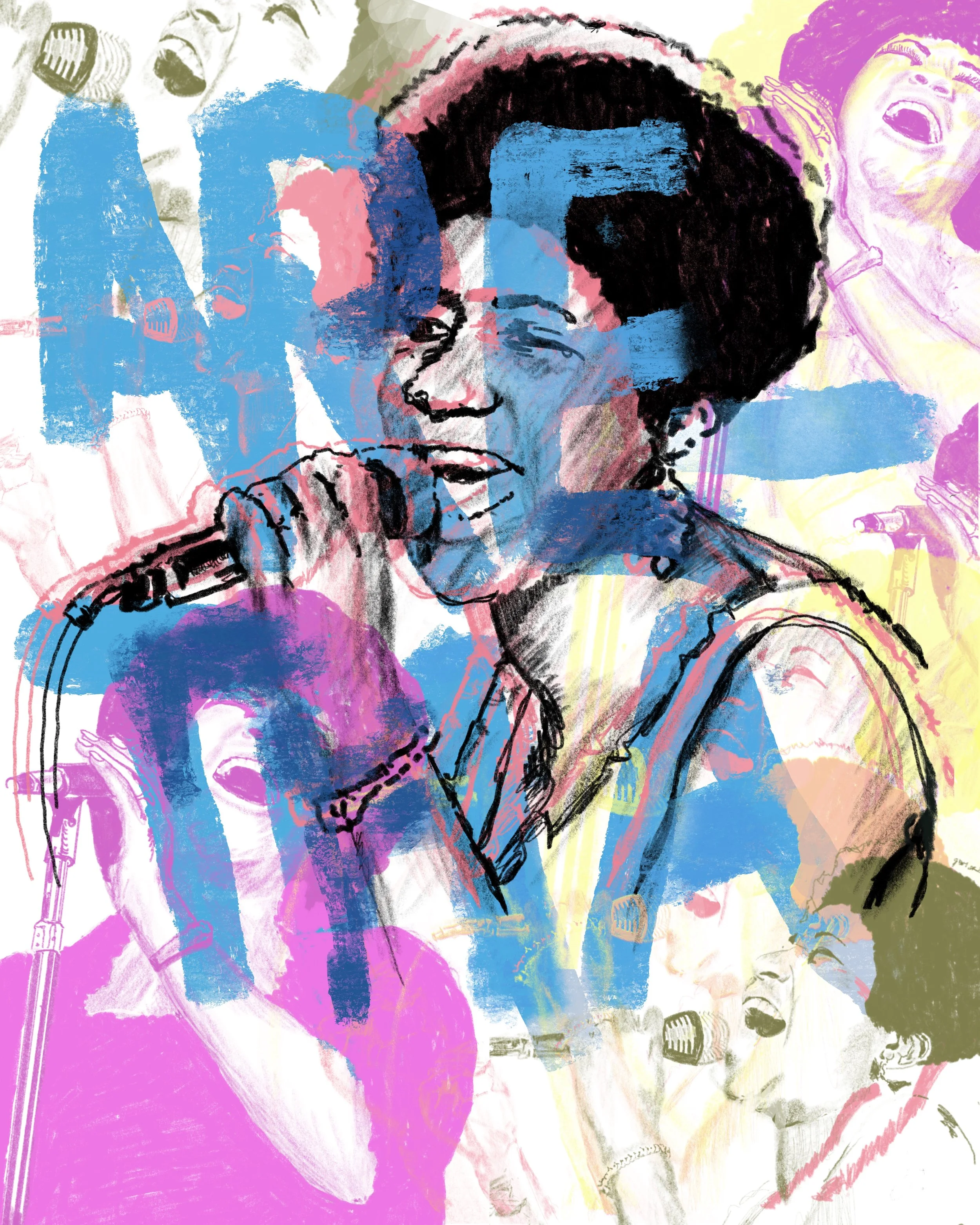
Aretha Franklin’s rendition of "Respect" turned into a genre-defining moment, and there's a temptation to illustrate that moment instead of the woman behind it. I went with the woman.
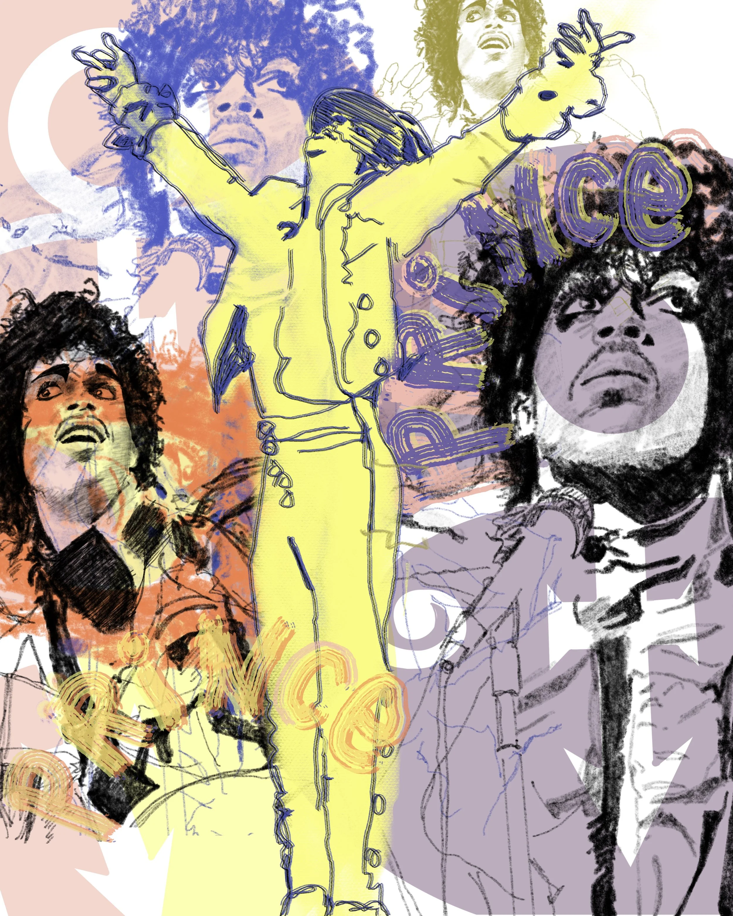
It’s impossible to pin down to one image, one costume, one decade for Prince, which is sort of the beauty of his life. He was about celebration and elevating people’s existence. The antics, the genius and the energy are all represented by the center yellow image of Prince.
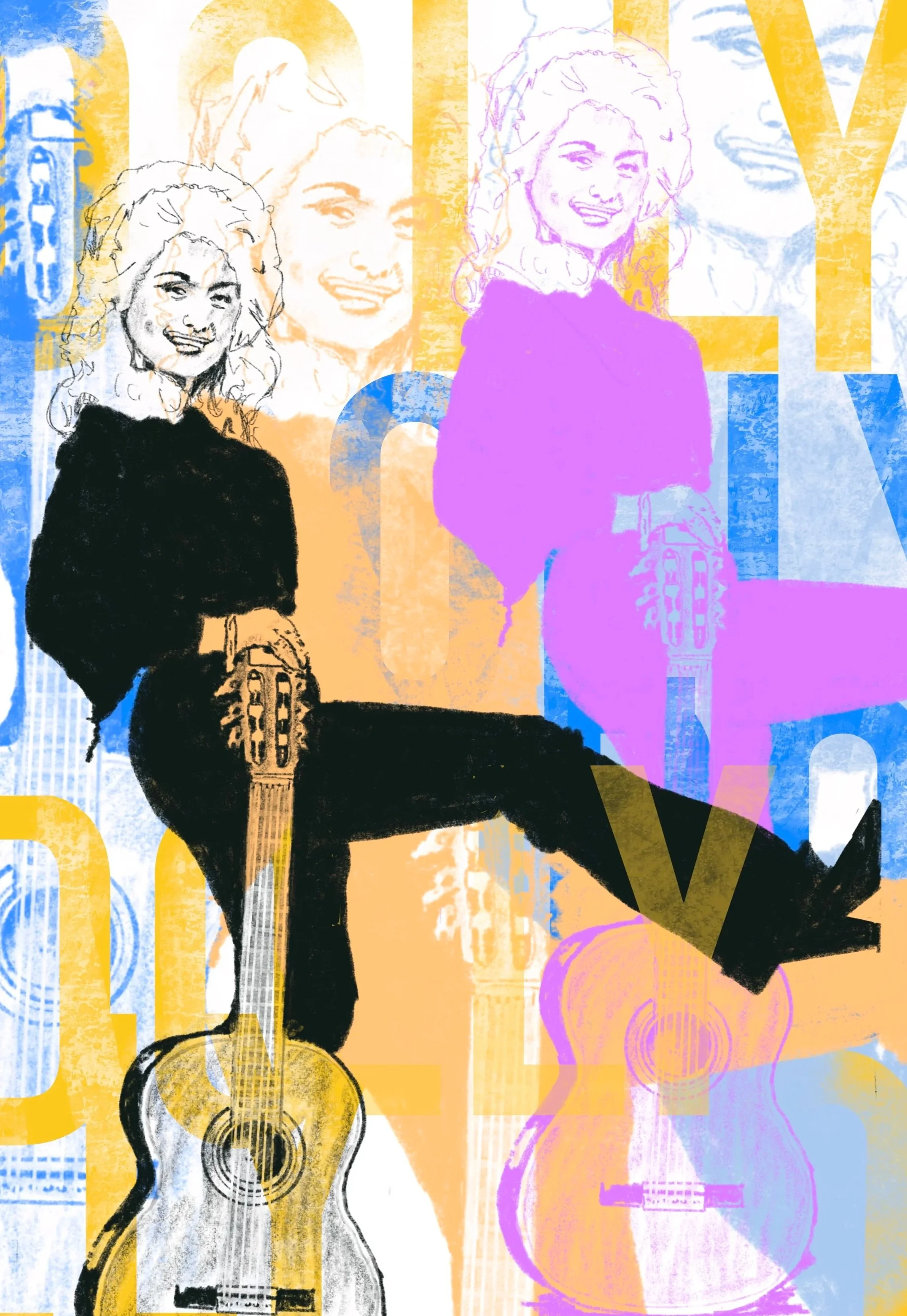
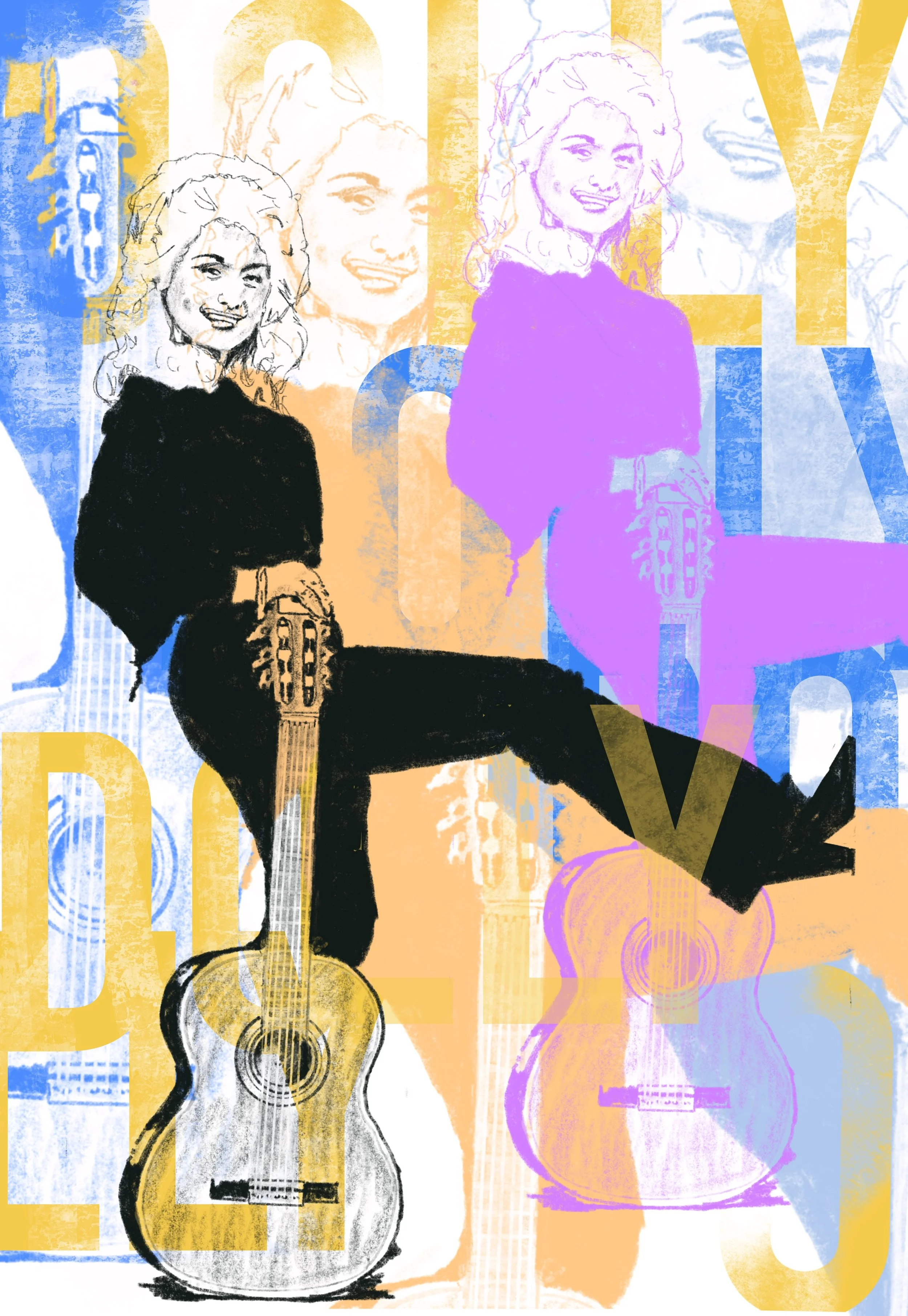
Dolly Parton is proof that "more" can be a genuine artistic choice instead of excess — the rhinestones and the wig are the point, not a distraction from the brilliant songwriting underneath. I tried to give both halves their due.
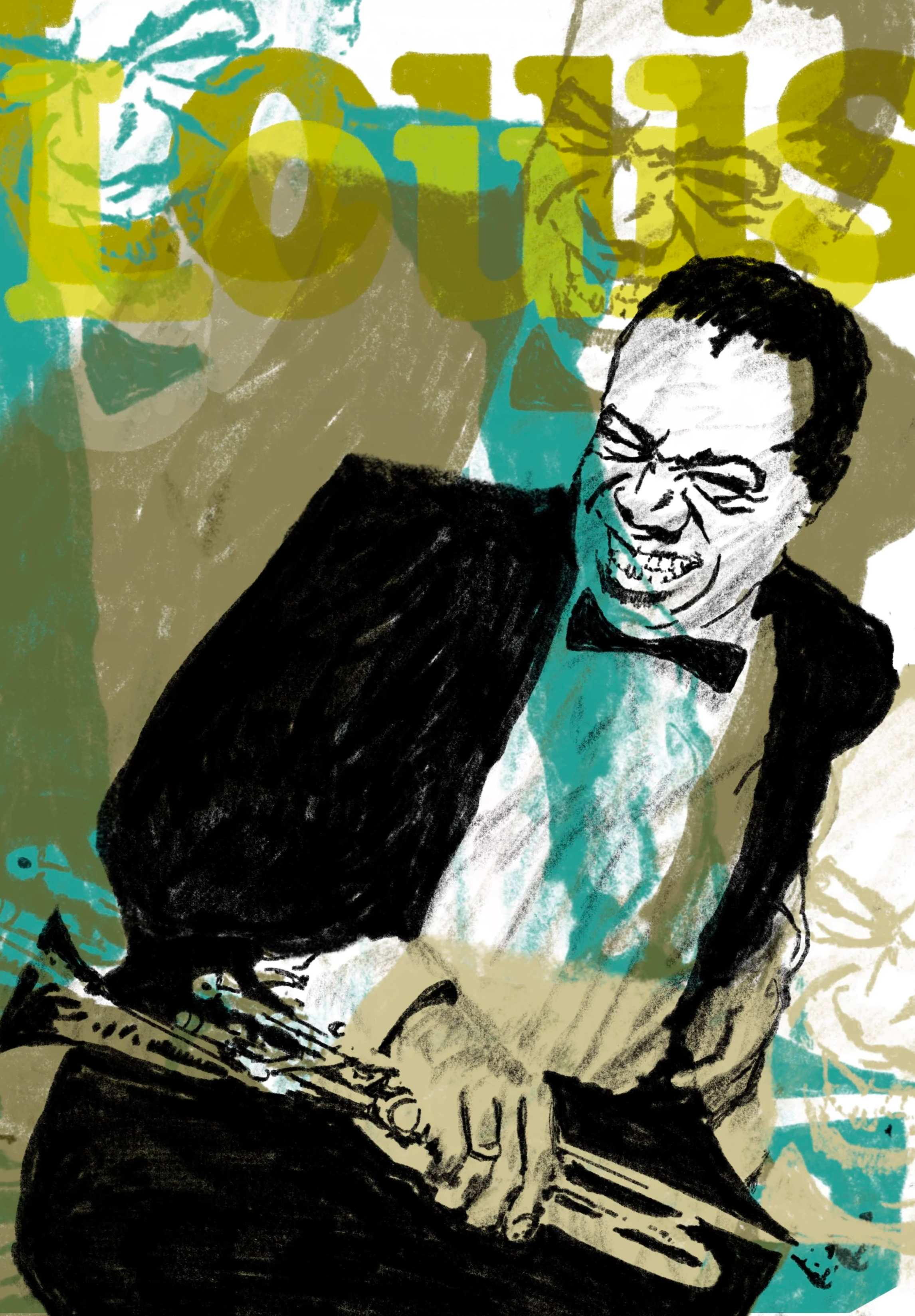
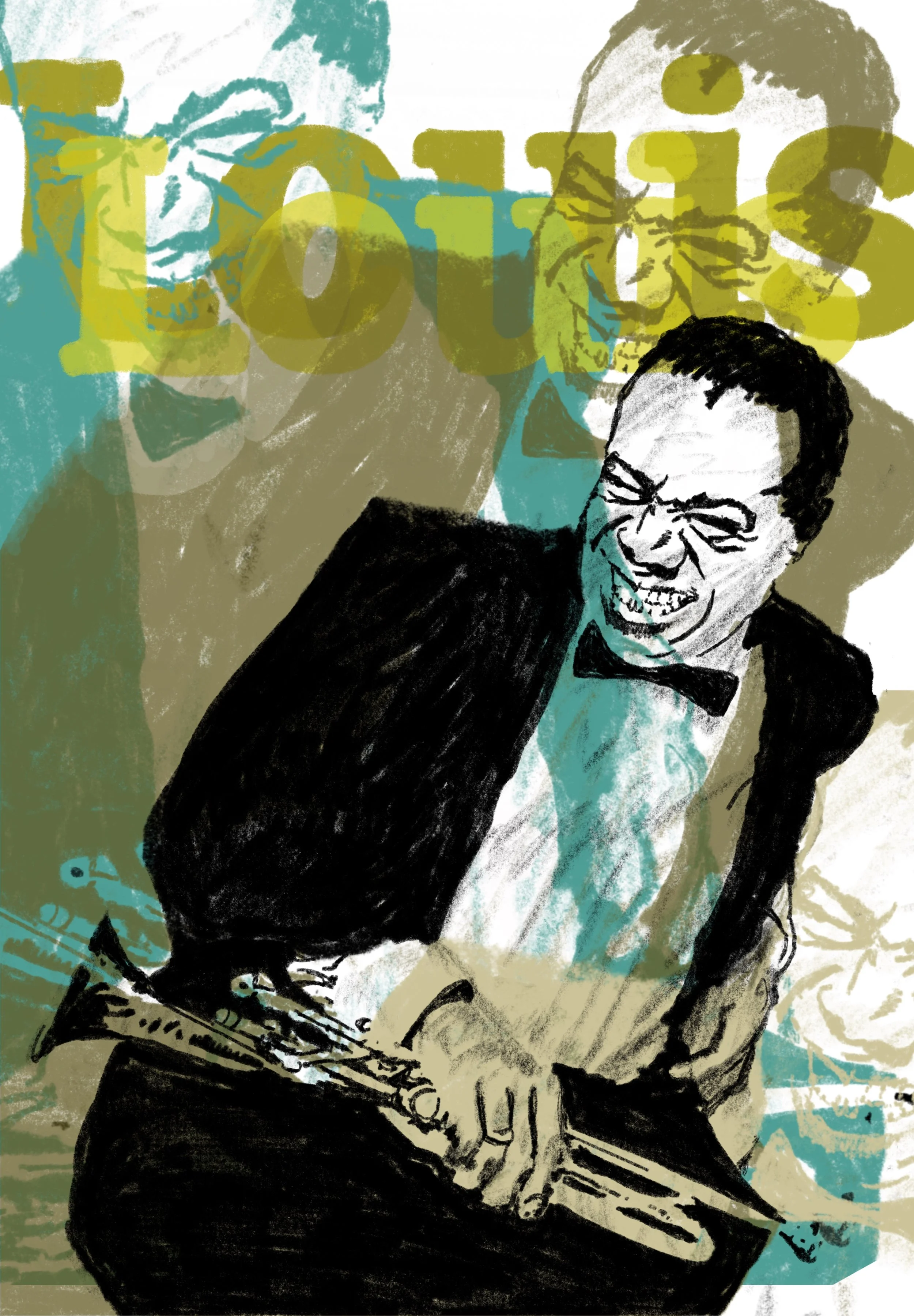
Louis Armstrong smiled through more than most people ever will and still sounded like joy every time he picked up a horn. The contradiction of a hard life and an unmistakably warm sound is what I wanted on the page.
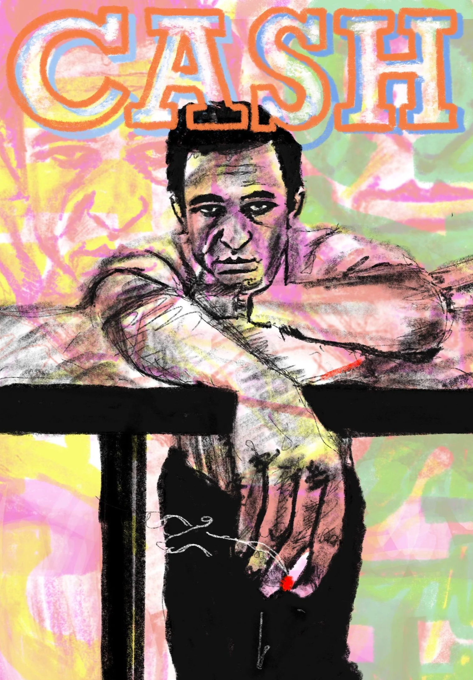
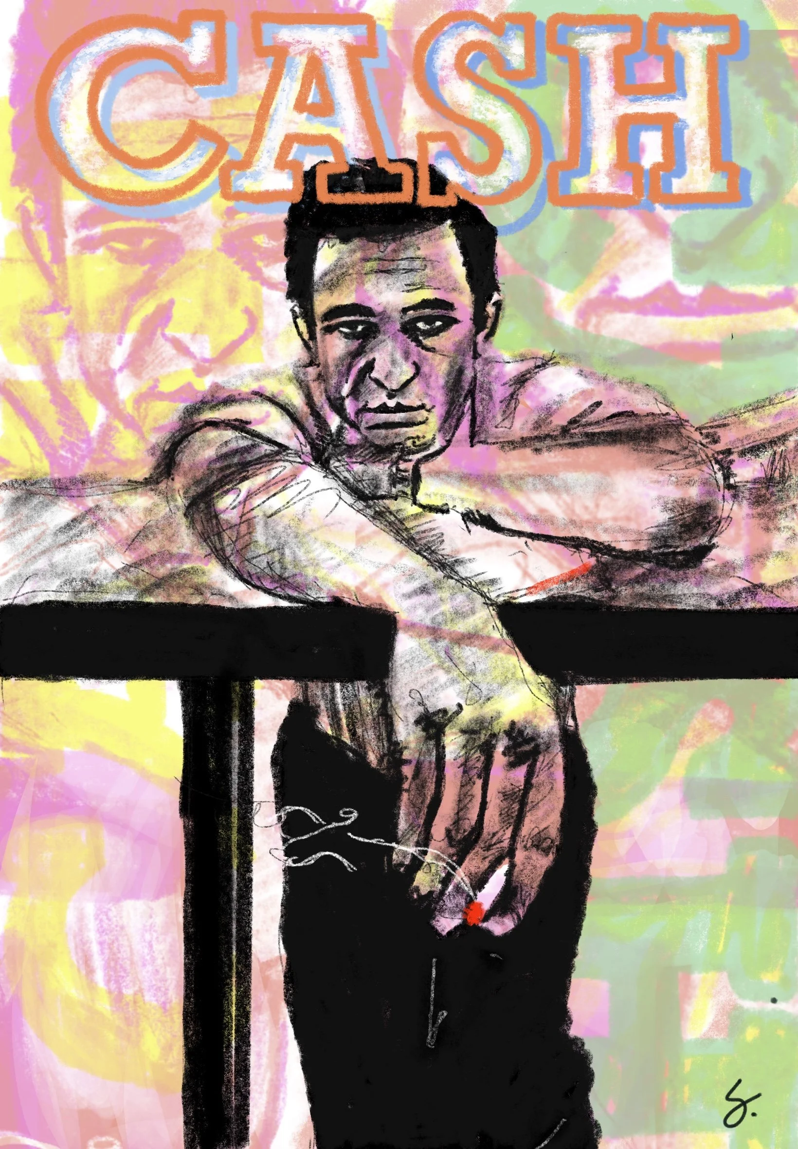
Johnny Cash’s relevance never weened or waned. The Man in Black earns the nickname through restraint, not decoration. This piece leans into that — less about ornamentation, more about presence.
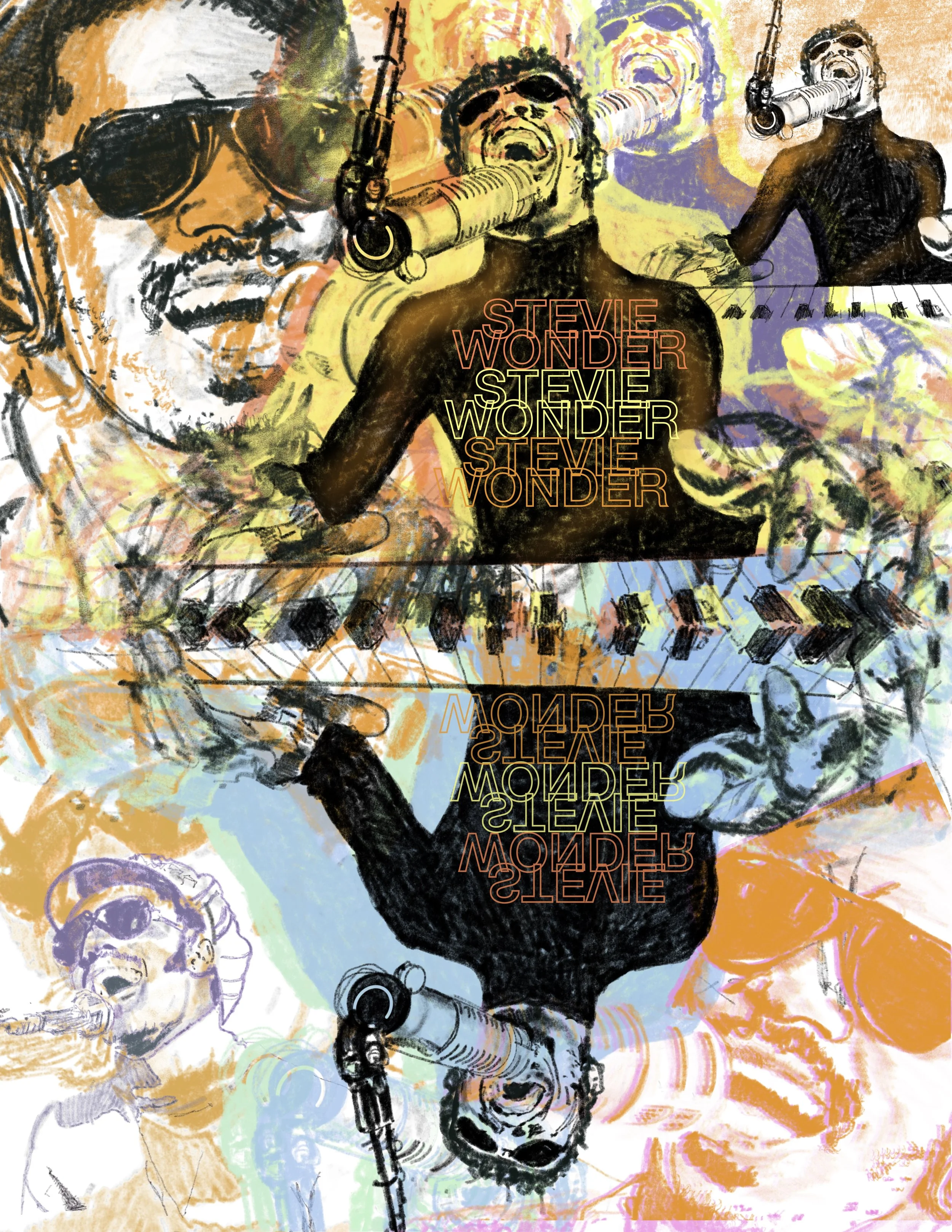
Stevie Wonder’s music has probably had the biggest effect on me that all others. “Songs in the Key of Life” is my all-time go-to album. And it still holds up after 50 years. Stevie Wonder's music is almost impossible to translate into a static, but this is my attempt, nonetheless.
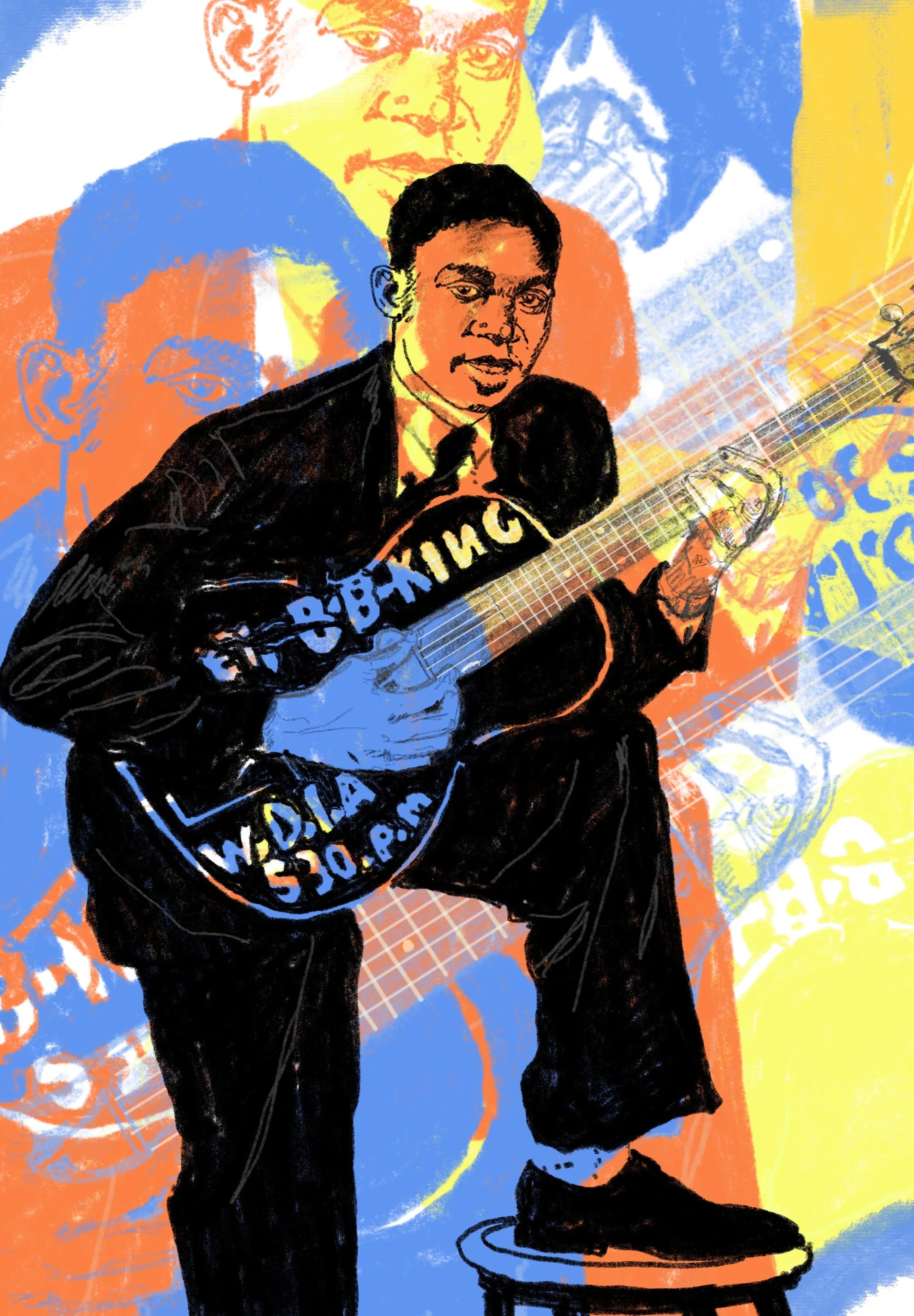
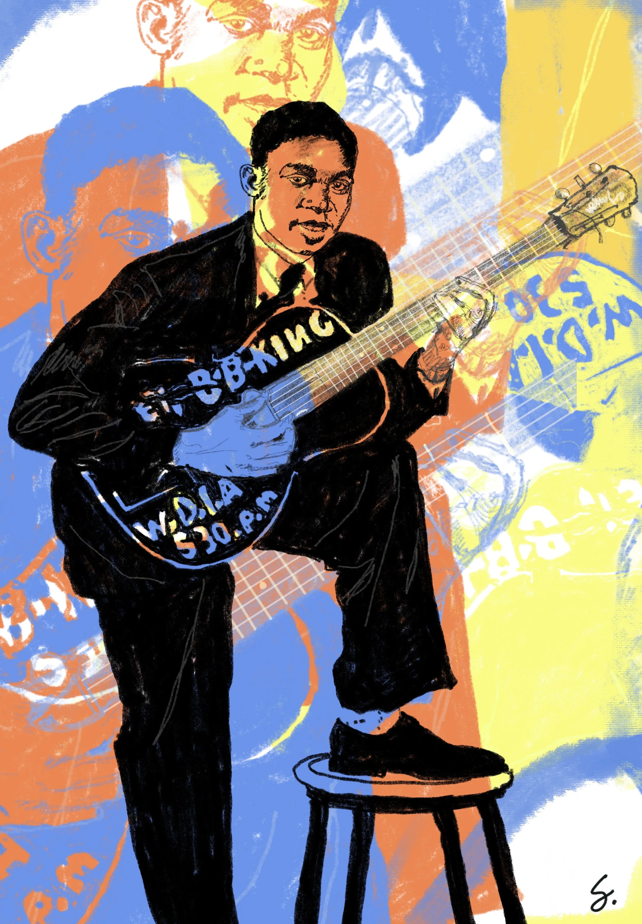
A guitar named Lucille, a career that outlasted just about everyone else's, and a tone you could pick out of a hundred players blind. This one's built around that tone.
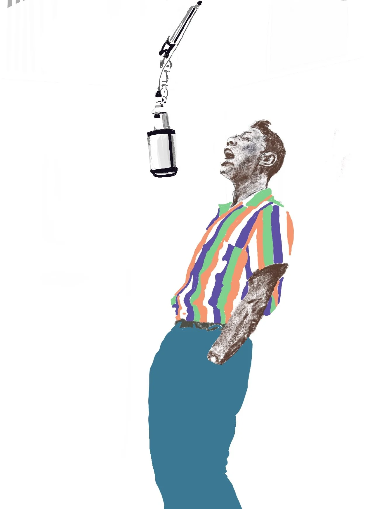
Nat King Cole's voice is the kind that makes a room feel like it's 11pm even at noon. This piece is aiming for that same unhurried warmth and simplicity.
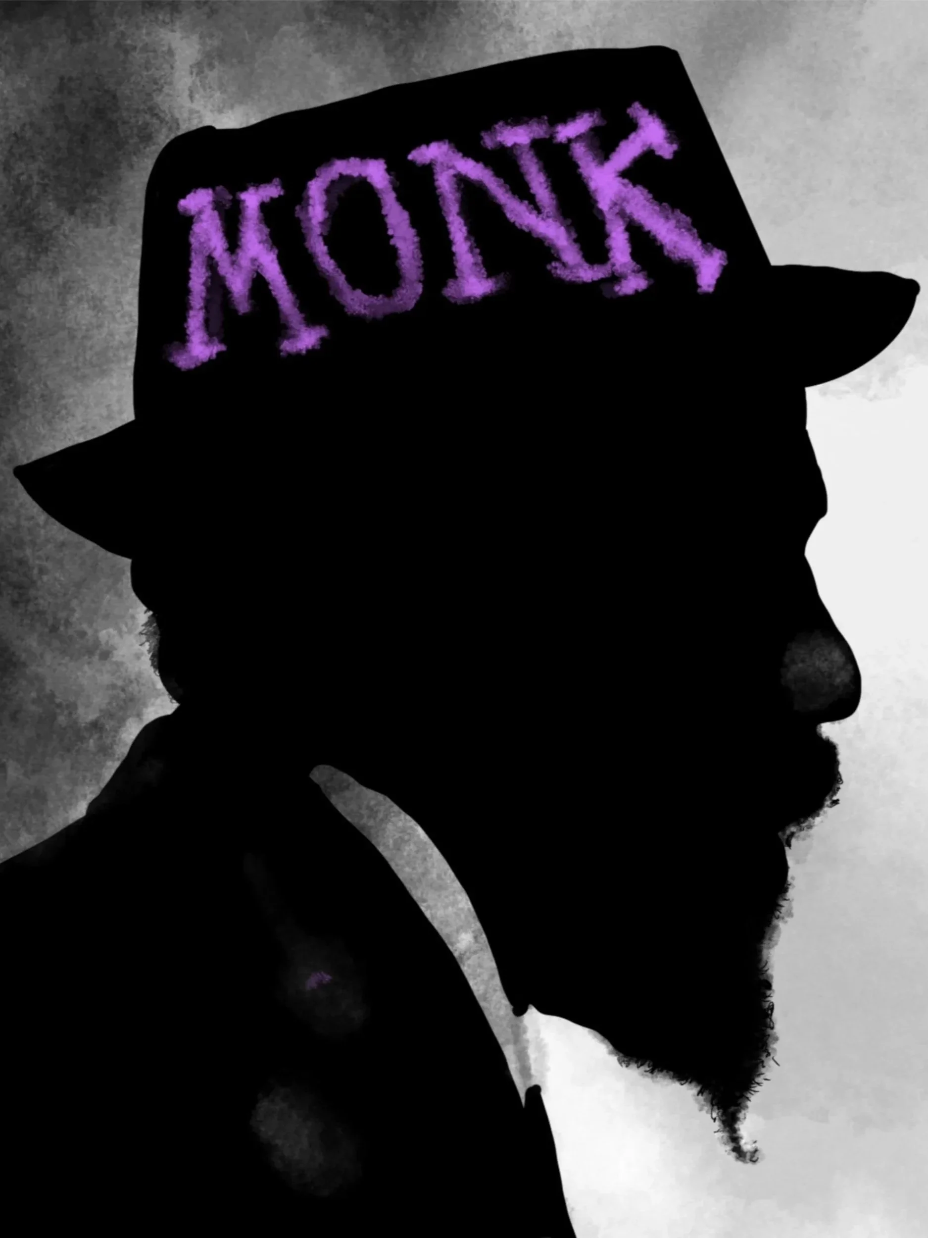
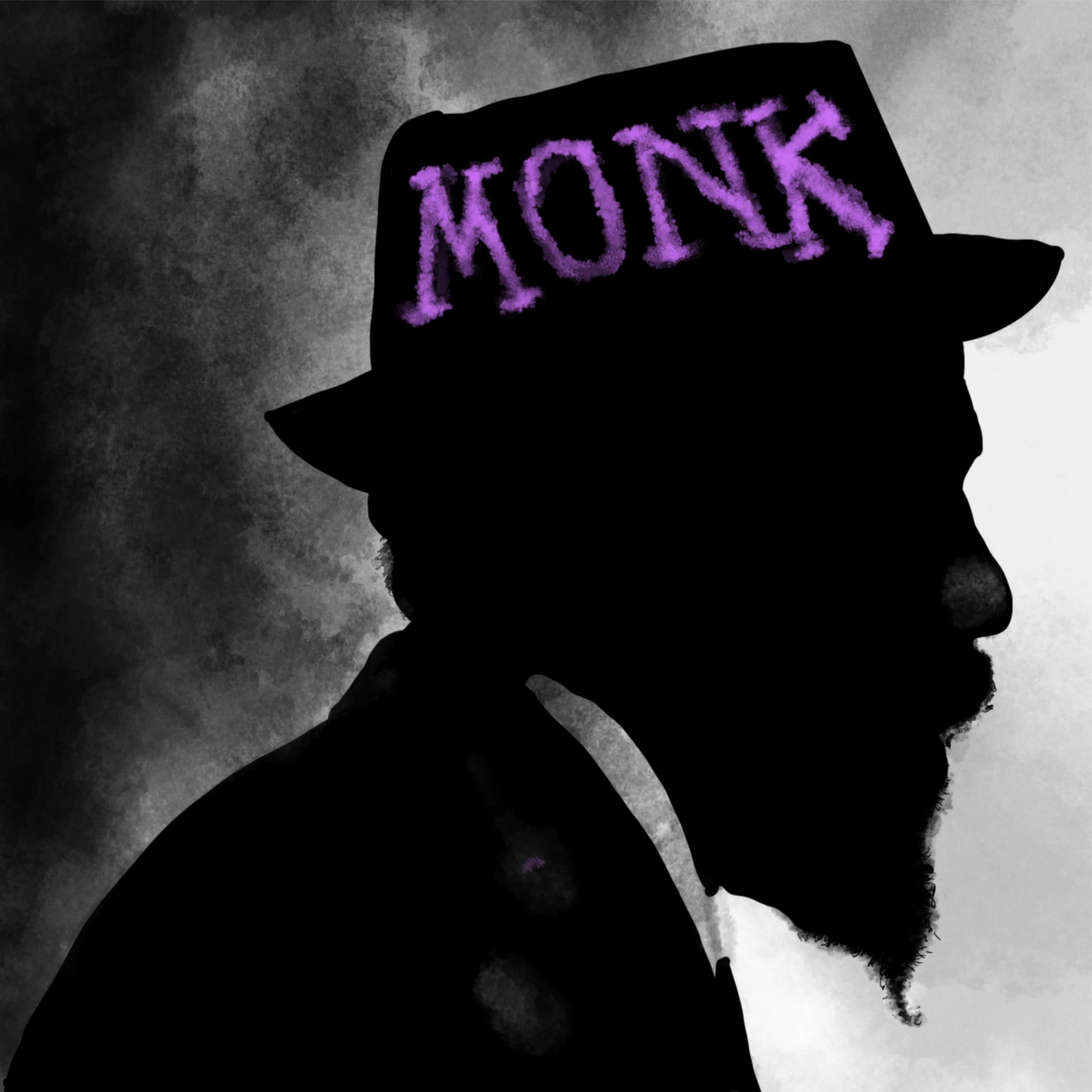
A second pass at Monk because one version wasn't enough to capture him — which, honestly, might be the most Monk thing about this pair. Some subjects get one shot. He got two. Colorful and thoughtful.
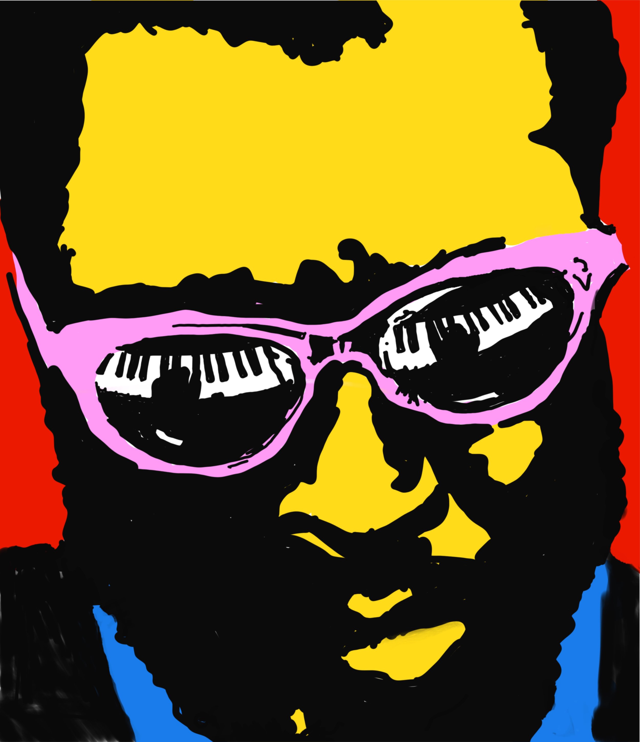
Thelonious Monk played piano like he was daring the instrument to keep up with him — odd angles, unexpected pauses, total confidence in the unconventional. That's basically a mission statement for this piece. All the colors of Monk.
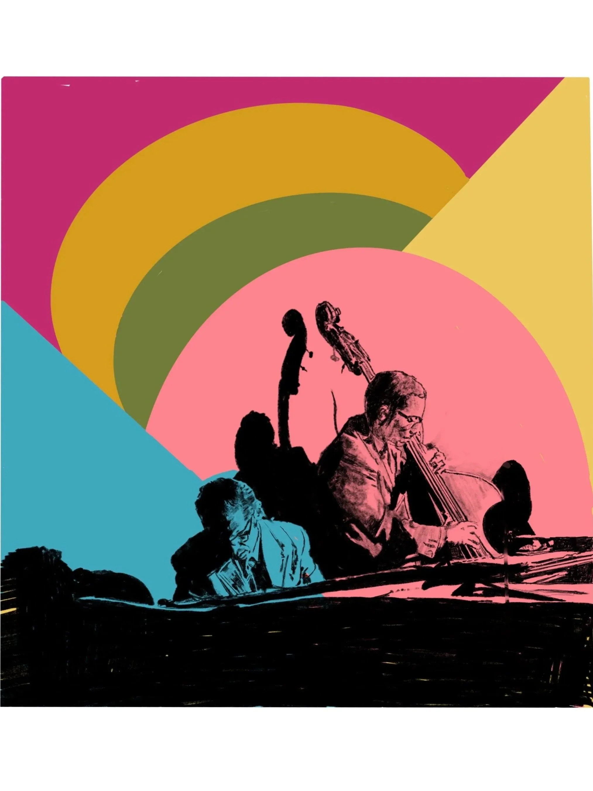
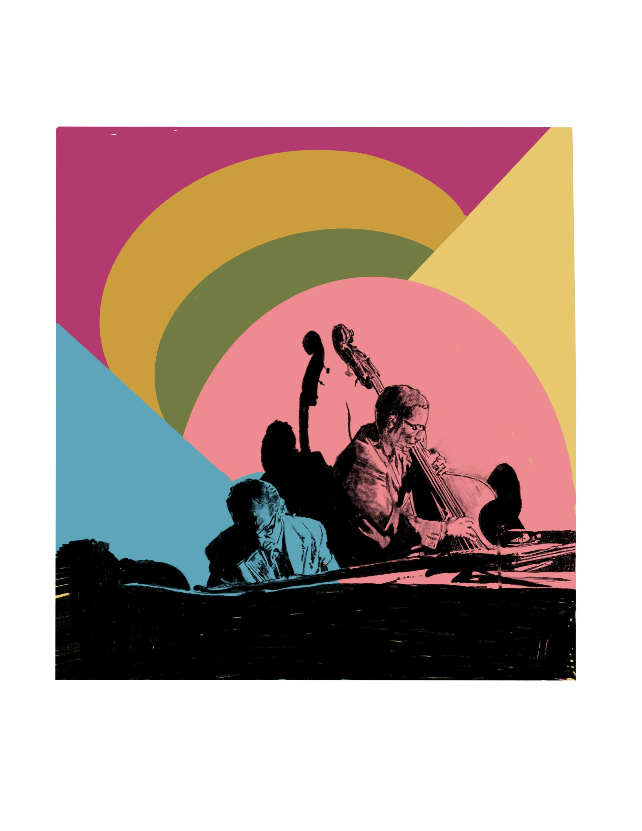
A personal favorite, Evans played with a kind of introspective precision that most piano players spend a career chasing. This piece is quieter than the rest of the Music Series on purpose — the subject demanded it.
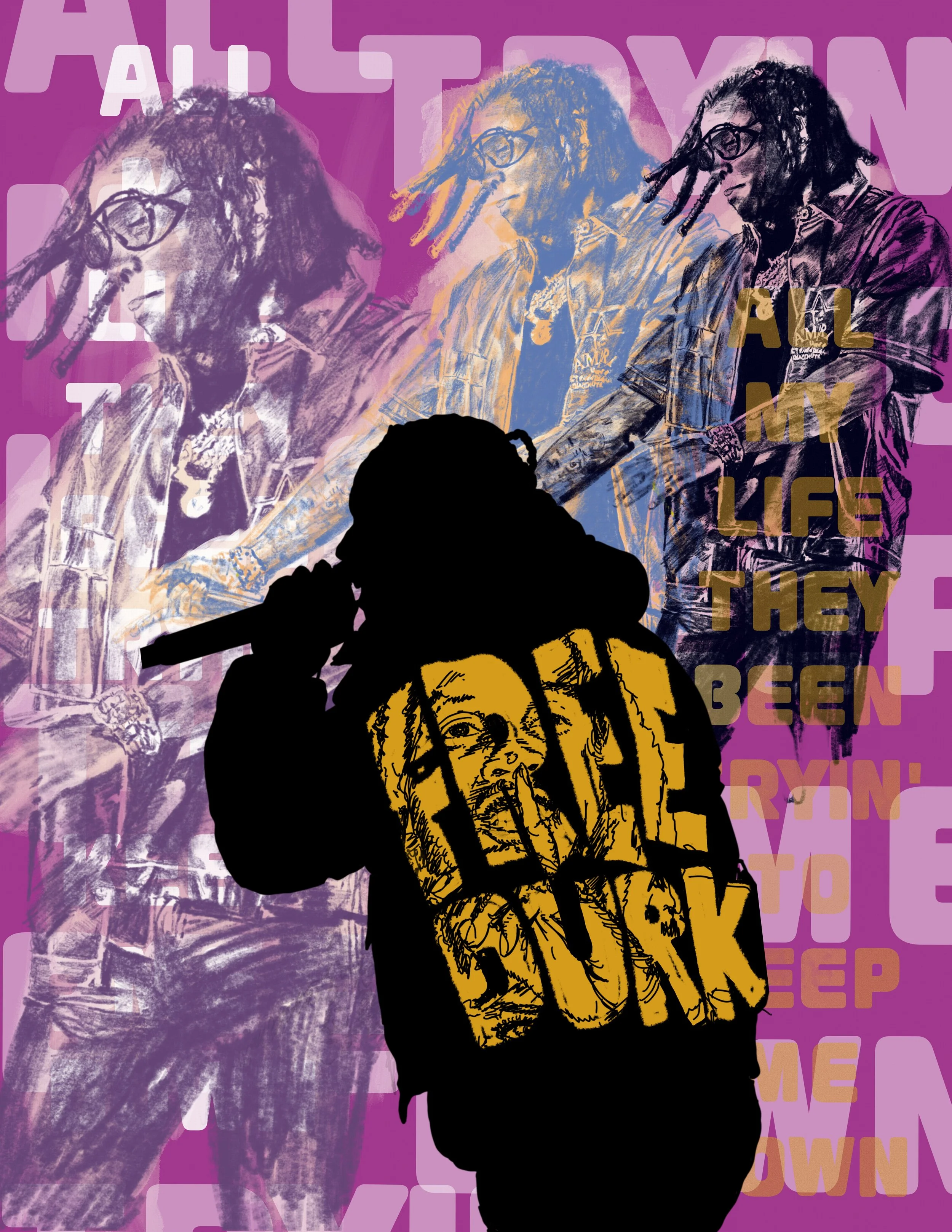
An innocent man should not be behind bars. Lil Durk did his time, and now it’s time to soar again!
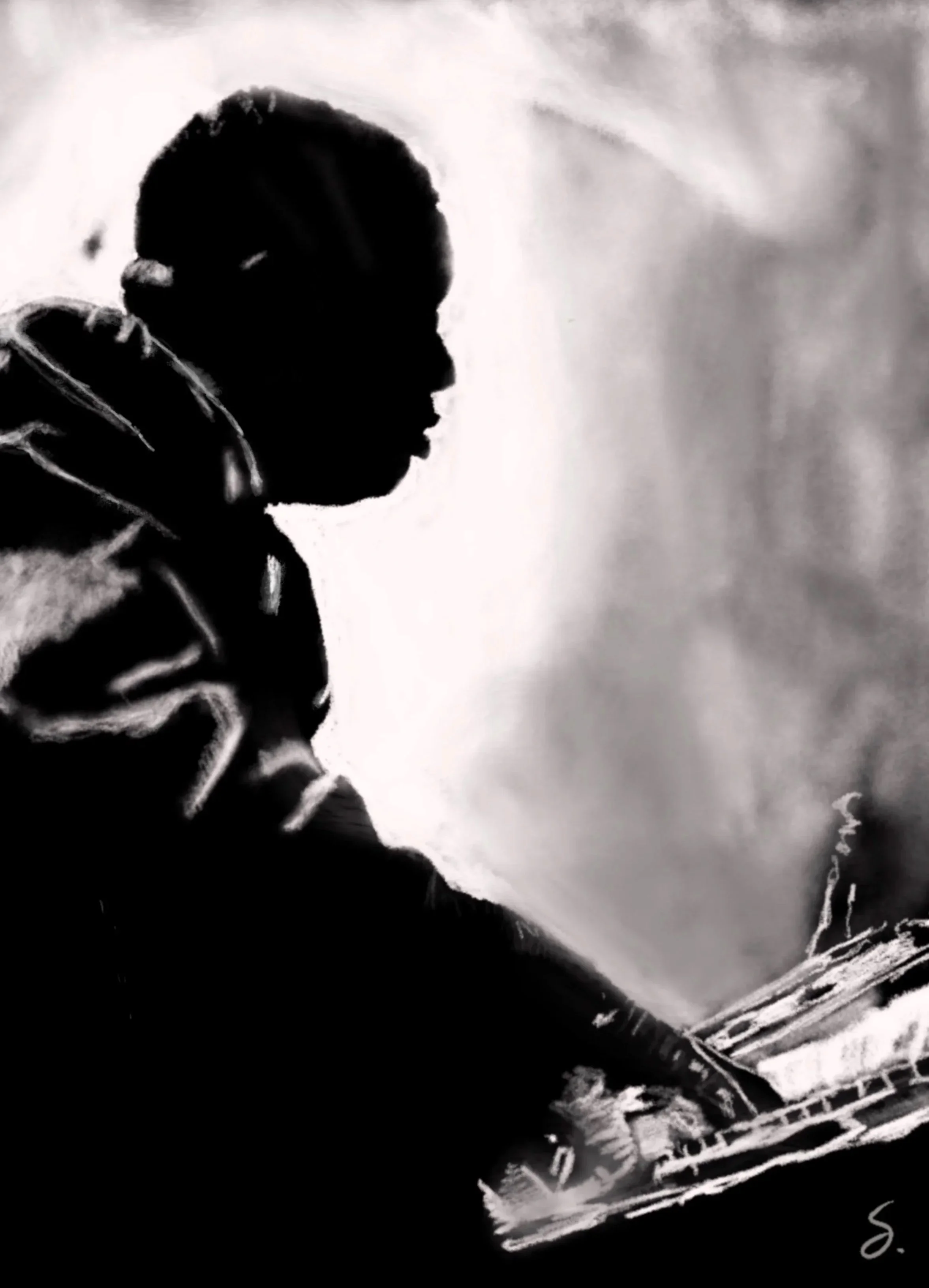
Sometimes the instrument is the icon. This one's a love letter to the piano itself — the physical, mechanical, slightly absurd size of the thing — rather than any single player at the keys.
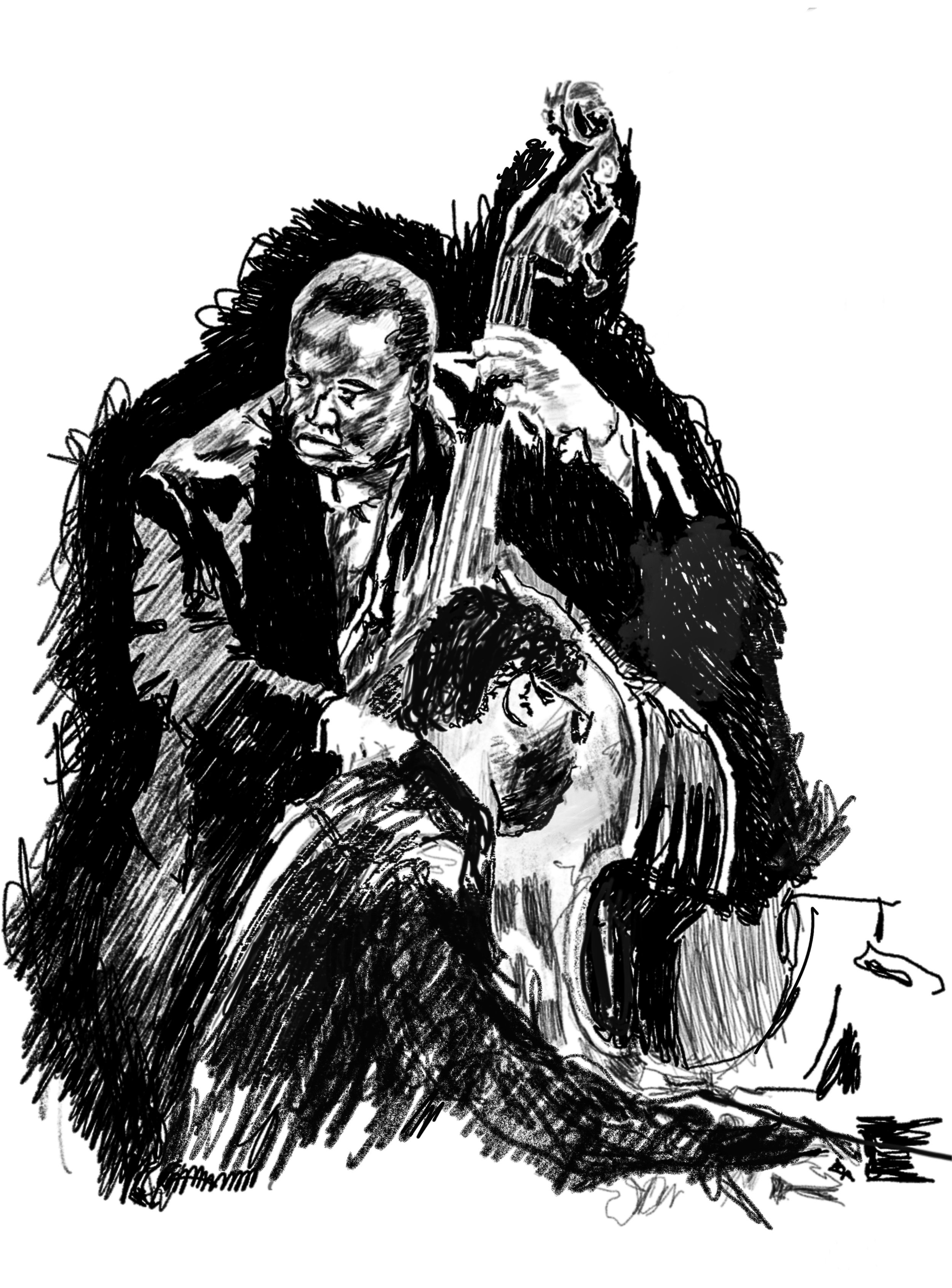
You don’t have to be there to hear what’s going on here. Obviously, the bass is in the middle of his solo and the piano is quietly complimenting each phrase like they’ve practiced it a thousand times, even though it’s the first time anyone has ever heard it.
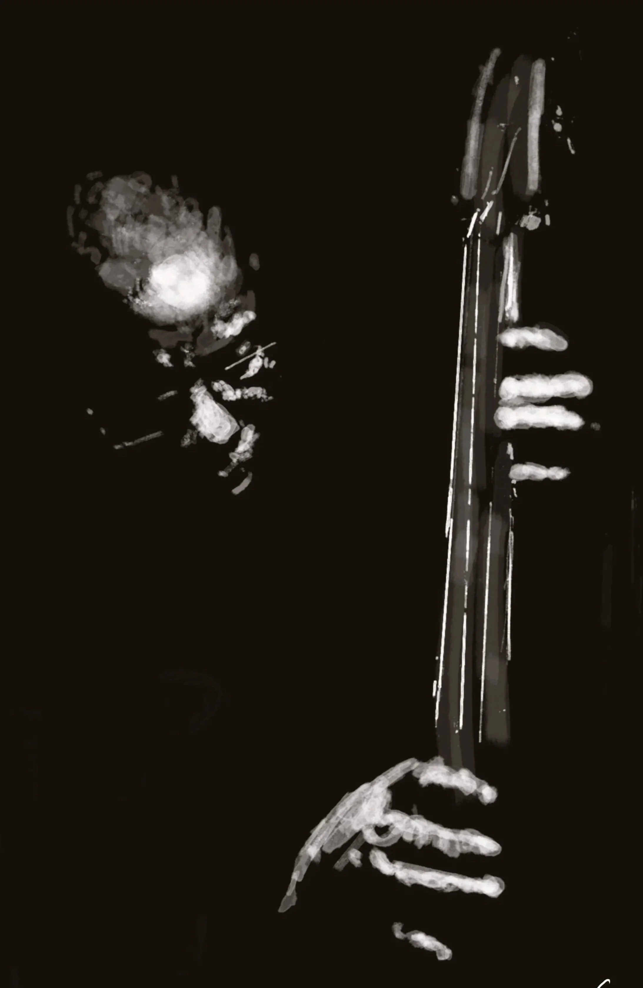
Not a portrait — a moment. The pentatonic scale is the backbone of half the solos you've ever hummed without knowing their name, and this piece is my attempt to draw the shape of that instinct instead of a face.
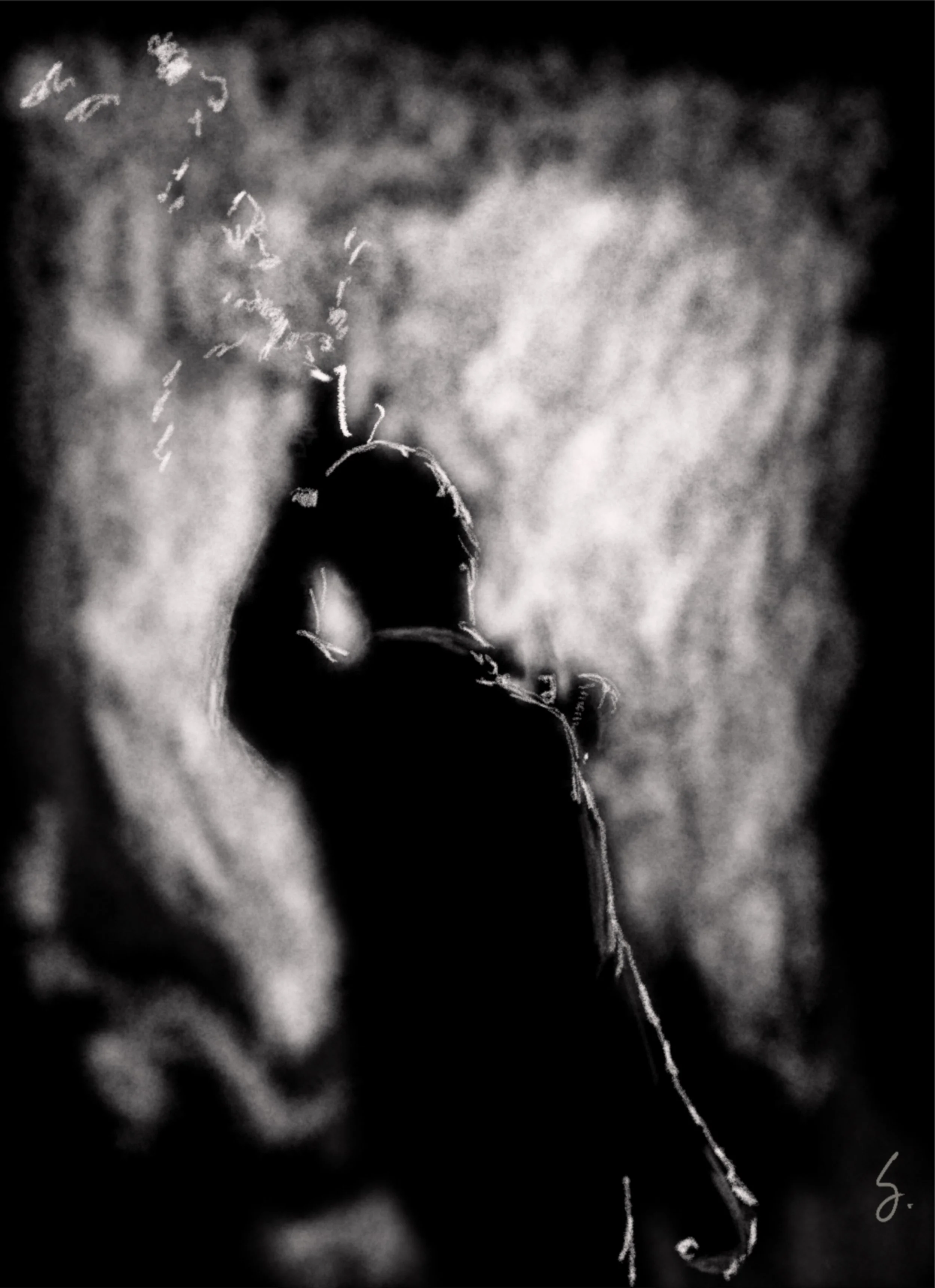
Sinatra built an entire persona out of confidence and phrasing — the way he'd lag behind a beat just enough to make you lean in. This piece is trying to draw that same lean.
Fashion Posters
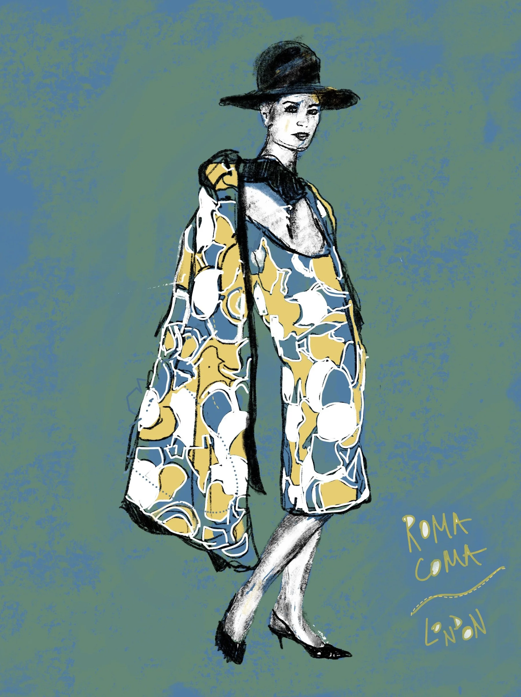
Rome, mid-'60s was bold in a way that reads as confidence more than excess, the kind of look that could stop a piazza. As the others, it started as a black-and-white editorial photo before I reworked the palette and the energy underneath it. The name's the joke and the tribute at once: a look striking enough to knock you out cold.
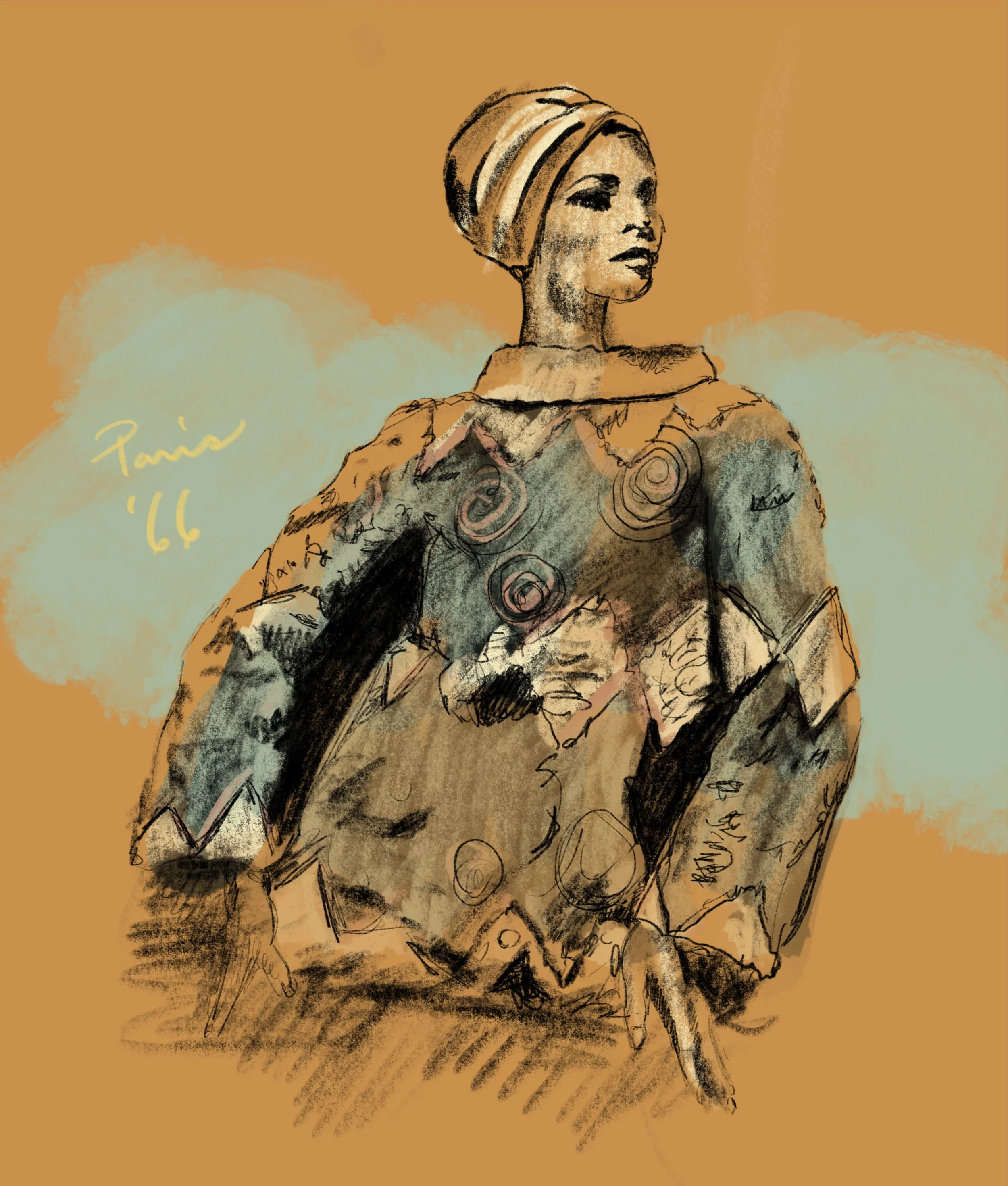
Found in an old editorial promo piece, shot in black and white the way everything was in those days. It somehow felt more like a blueprint than a finished thing. I kept the composition and the attitude, and gave it new color and a new, different kind of energy. Paris in the mid-'60s wasn't just a fashion capital, it was a dare — this is one small piece of that.
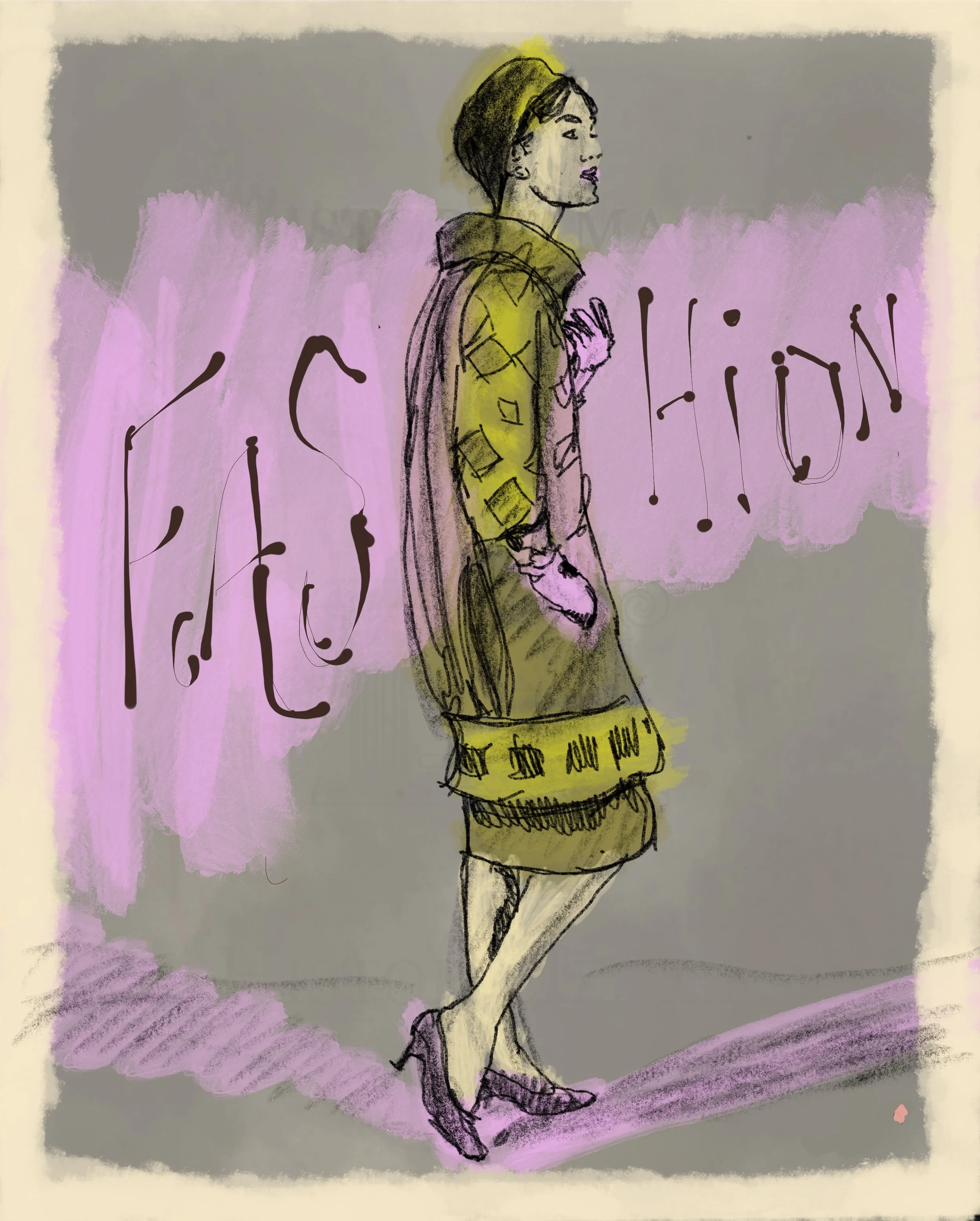
The runway energy of New York in the mid-'60s was filled with a city busy inventing what "American fashion" would even mean. Like the rest of this series, it started as a black-and-white editorial photo before I reworked the palette and the energy underneath it. The '60s didn't do quiet fashion, and neither does this piece.
Novelty Posters
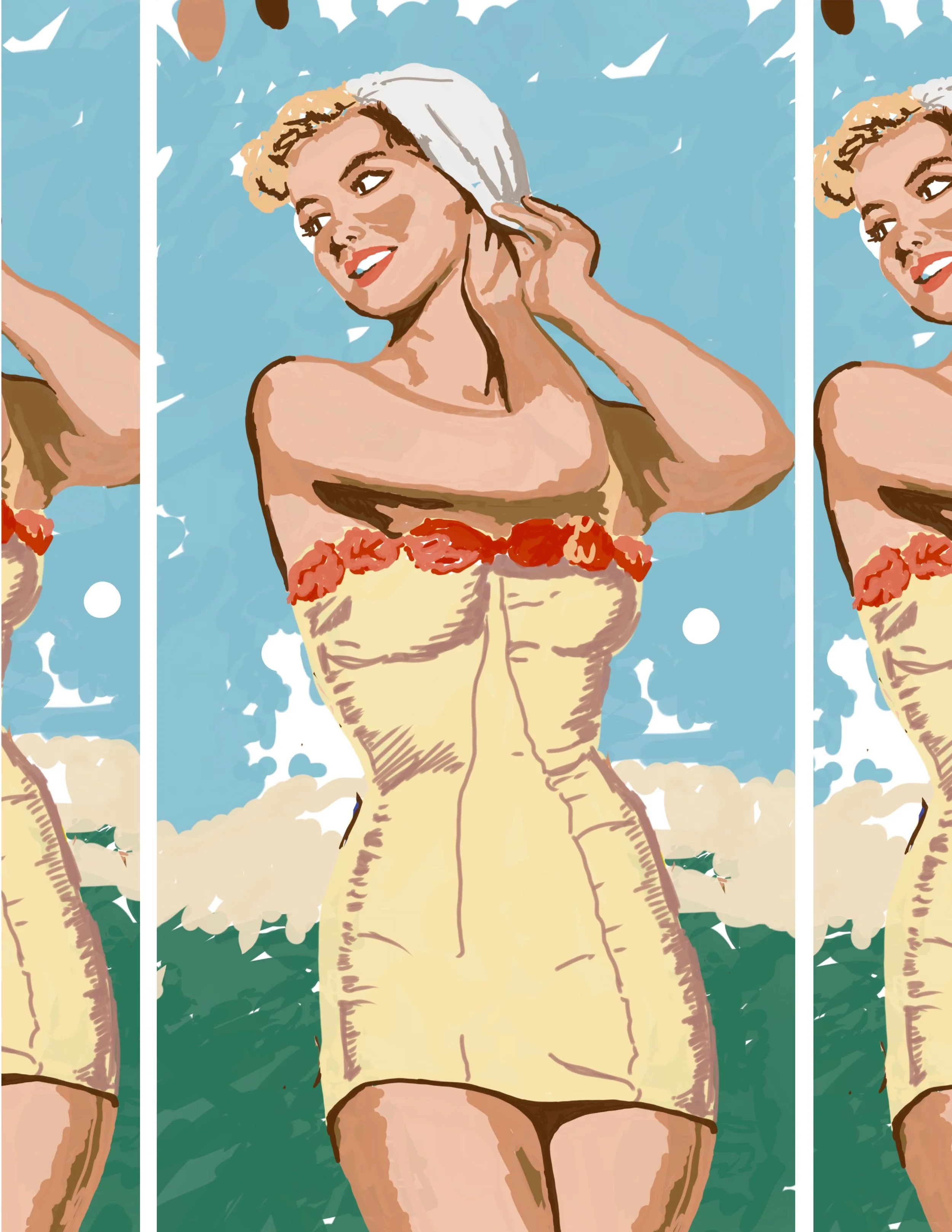
Inspired by old-style postcards and swimsuit ads from an era that had no problem objectifying the women in them. I wanted to take the same subject and strip out the objectification — leaning into gentler colors and a more innocent read on the same basic imagery, so the beauty comes through without the leer.
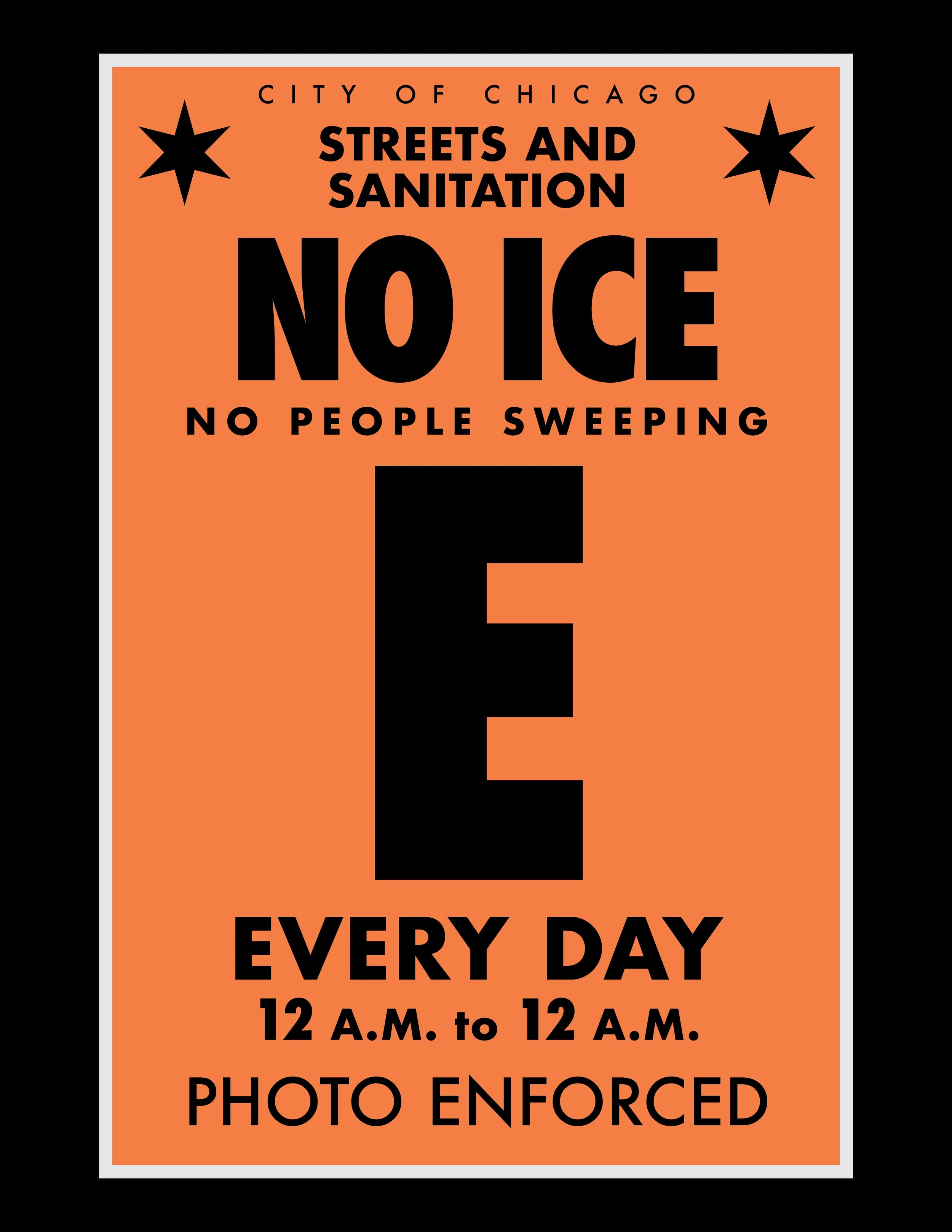
Chicago had a divisive few weeks this year until ICE was effectively driven out of the city. I was passing a Streets and Sanitation sign — the kind that warns of no parking on certain days for street sweeping — when the comparison hit me: ICE had been sweeping our streets too. This piece wraps that idea into the same visual language as the sign that inspired it. Not subtle. Not meant to be.
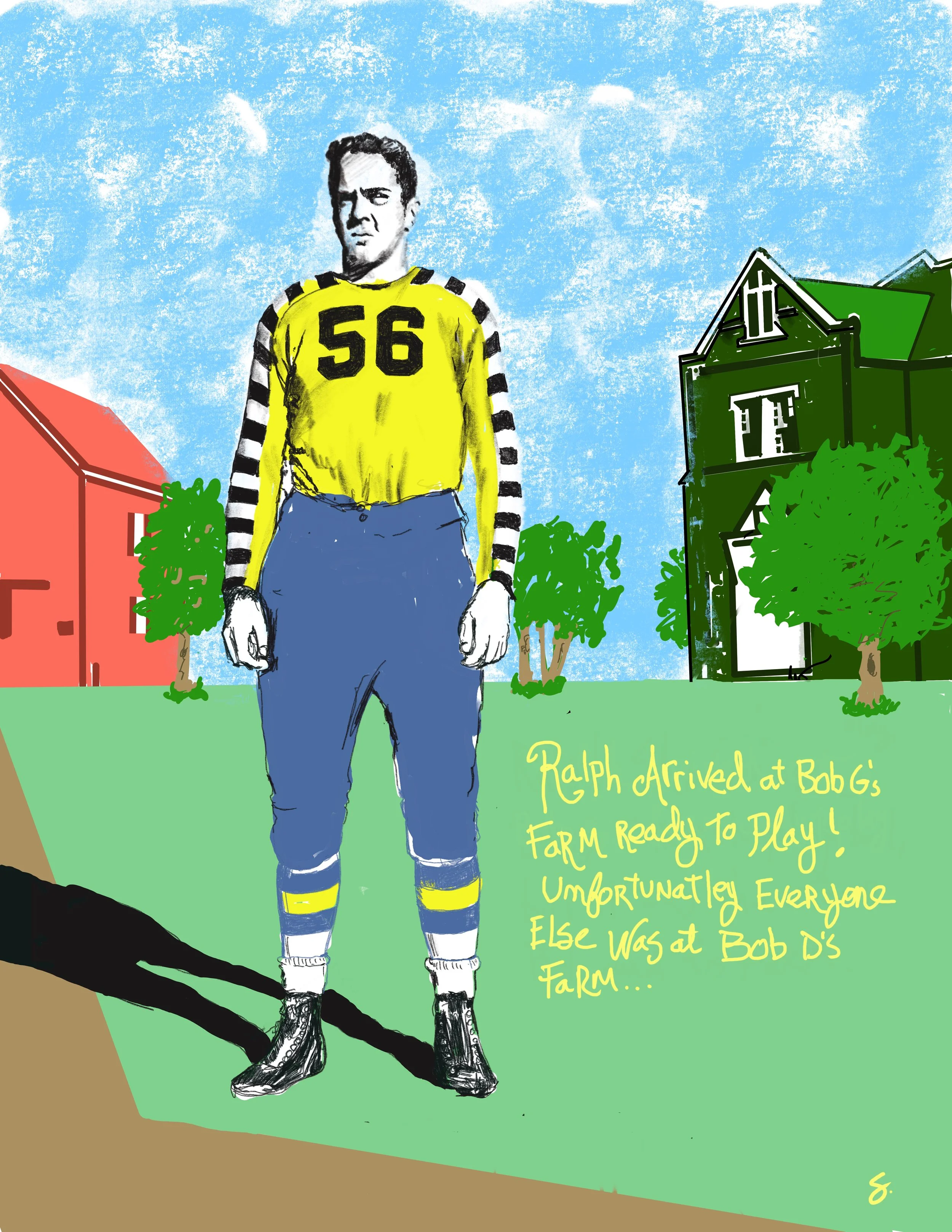
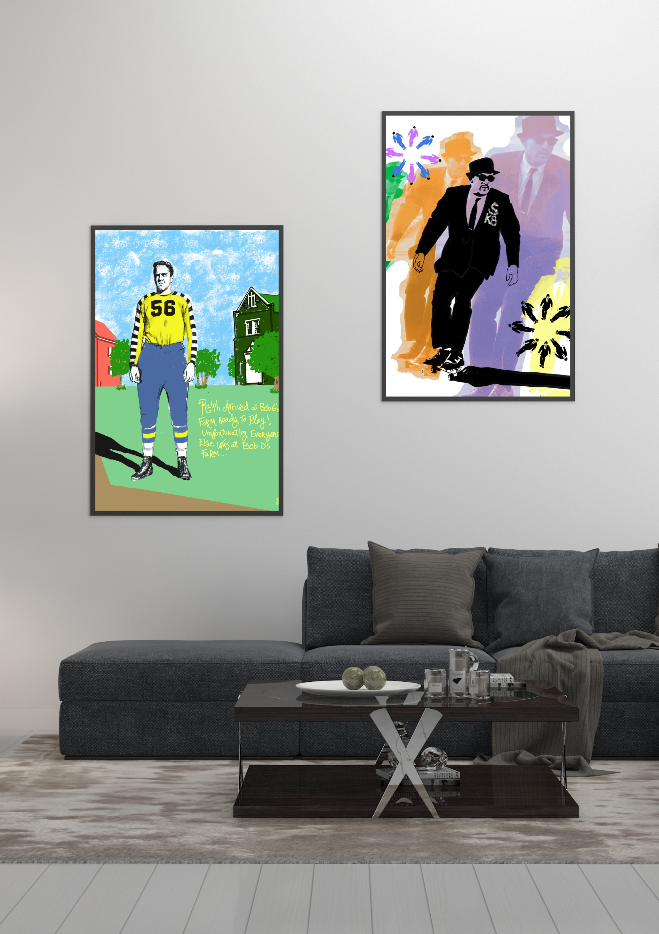
Started with a vintage photo of a lone football player, standing in a field looking completely lost. I leaned into that feeling instead of softening it — as if he'd shown up ready to play and just... went to the wrong field. A small, dumb, very human kind of tragedy.
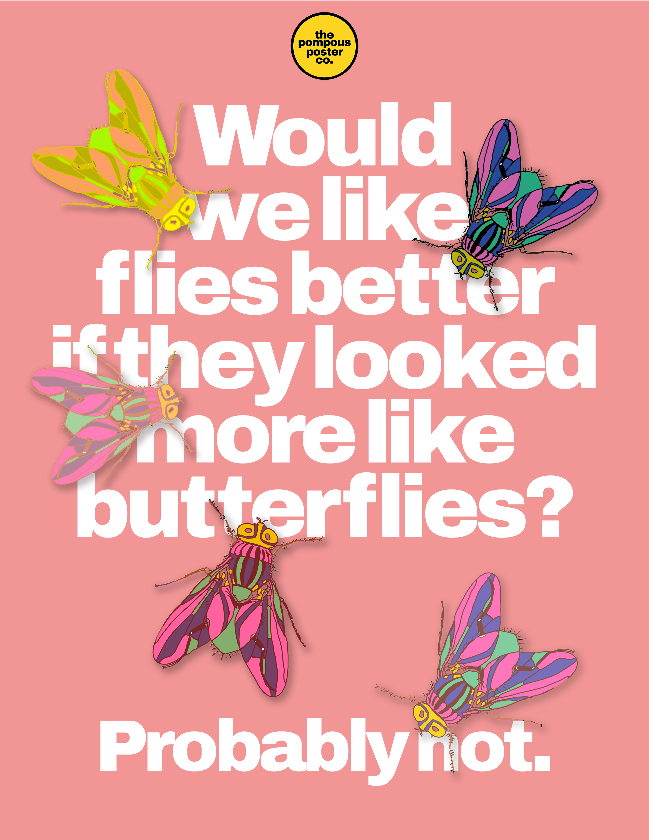
The whole piece started as a question: if flies looked more like butterflies, would we like them more? I spent a long time testing different color palettes on a fly's wings and body to find out. The answer, after all that: yes, a fly is more beautiful in the right color scheme — but it doesn't make the fly any more likeable. Worth the experiment anyway.
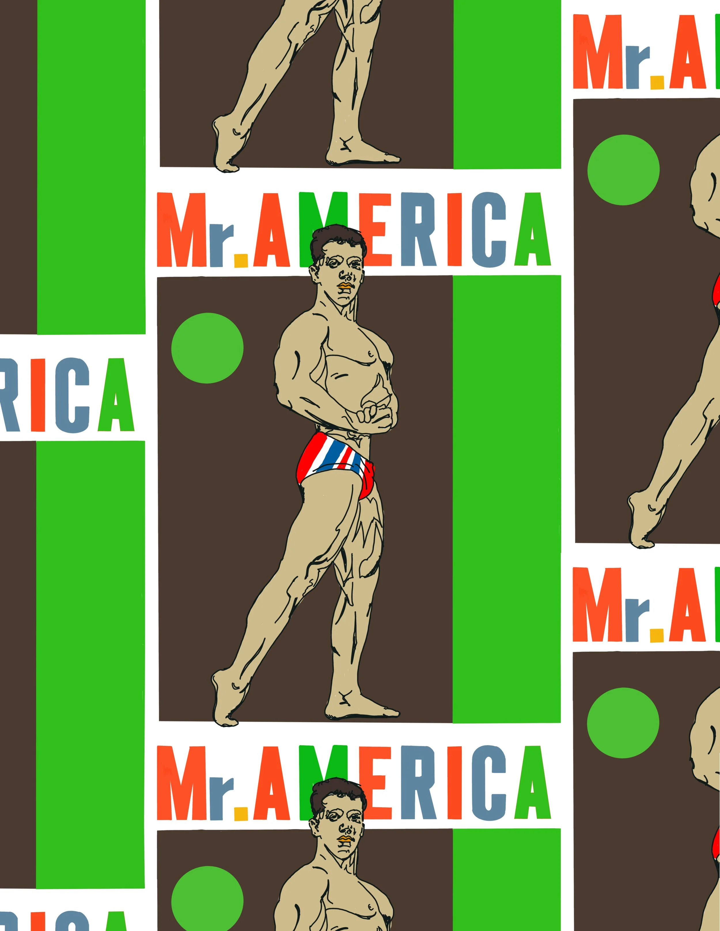
Came across old Venice Beach bodybuilders while researching for a possible beach collection, which led me down a rabbit hole into old Mr. America magazines. The campiness of that era's imagery was too good to leave alone, so I put my own spin on a reimagined cover.
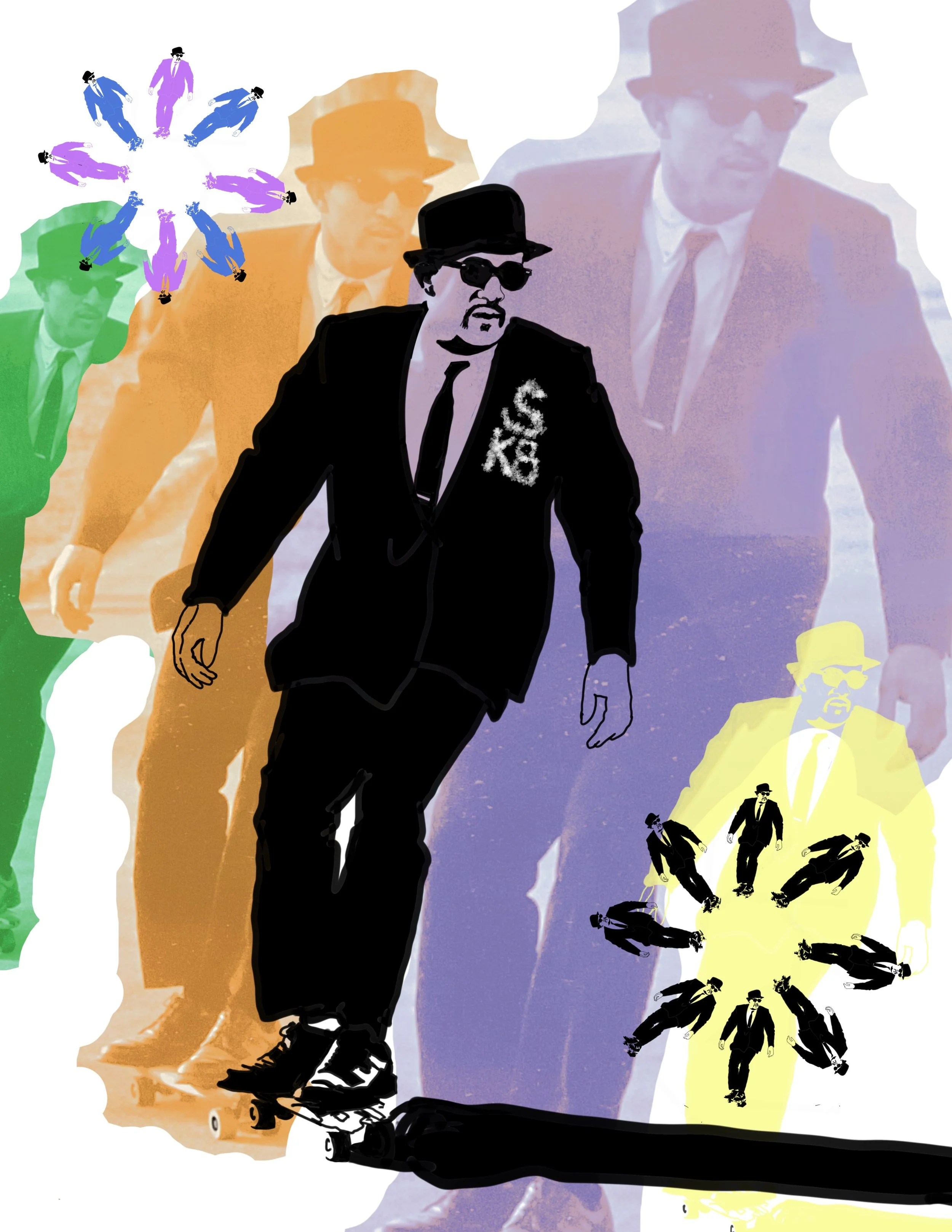
Built off a famous skater cult photograph, pushed toward something more "designy" (if that's a word) and more relevant to today's visual language. More than the style, though, I was chasing a feeling — the specific joy of catching air and knowing, for a second, that you nailed it.
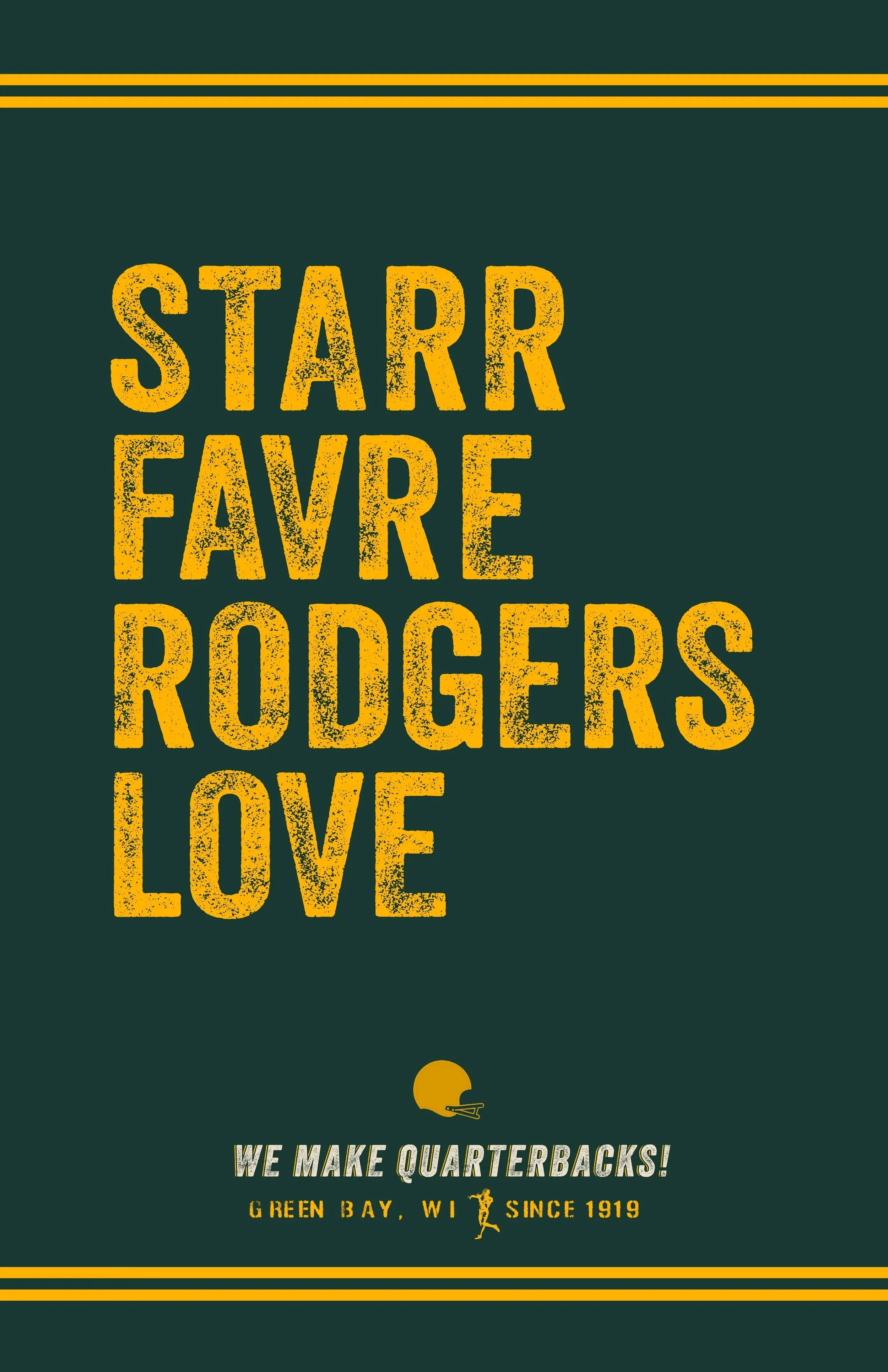
Growing up in Wisconsin, the Packers were a doormat, not a powerhouse — a franchise still living off the memory of Bart Starr and those first two Super Bowls. By the time I was an adult, that had completely flipped: one franchise quarterback for 16 seasons, then another for 18, and now a third keeping the run going. In that same stretch, the Bears have cycled through 37 starting quarterbacks. That gap is the whole joke — Green Bay isn't just a team, it's a factory.
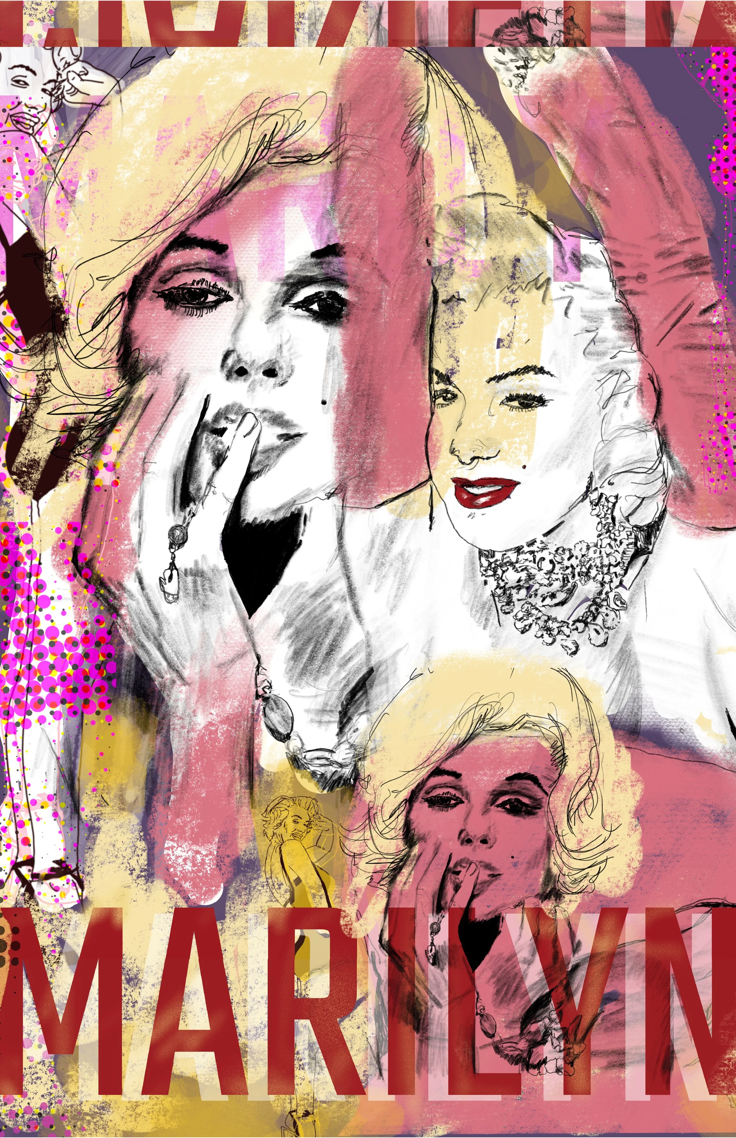
The challenge: How do you take the most reproduced face in pop art, and make it your own? Solution: Give in to the fact that some of the familiar imagery might already be living your head and give every line on the page a sense of energy and playfulness. And just trust in the fact that the effort will find her again, not just repeat her.
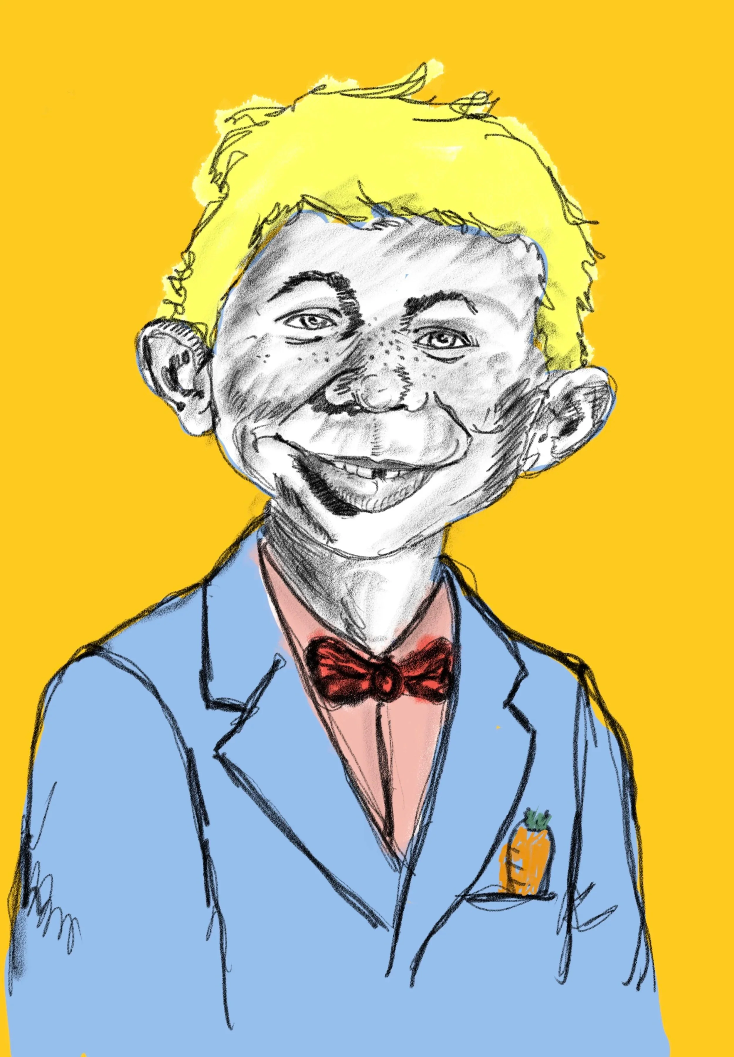
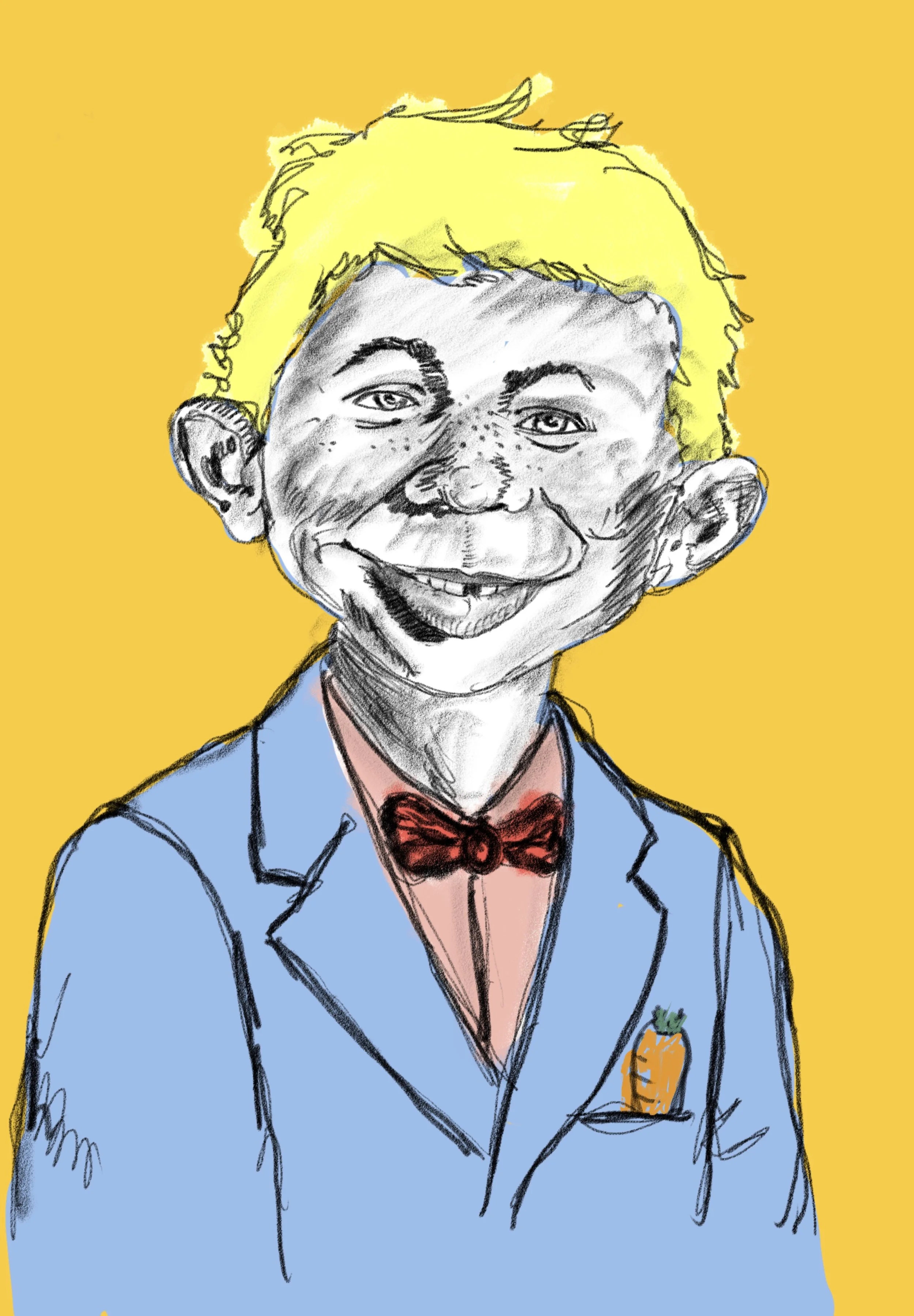
I grew up on MAD magazine — the variety of artists, the density of jokes, and honestly a real education in drawing just from copying what was on the page. This piece is a tribute to that influence: a big, unapologetic portrait of the mascot of the whole operation.
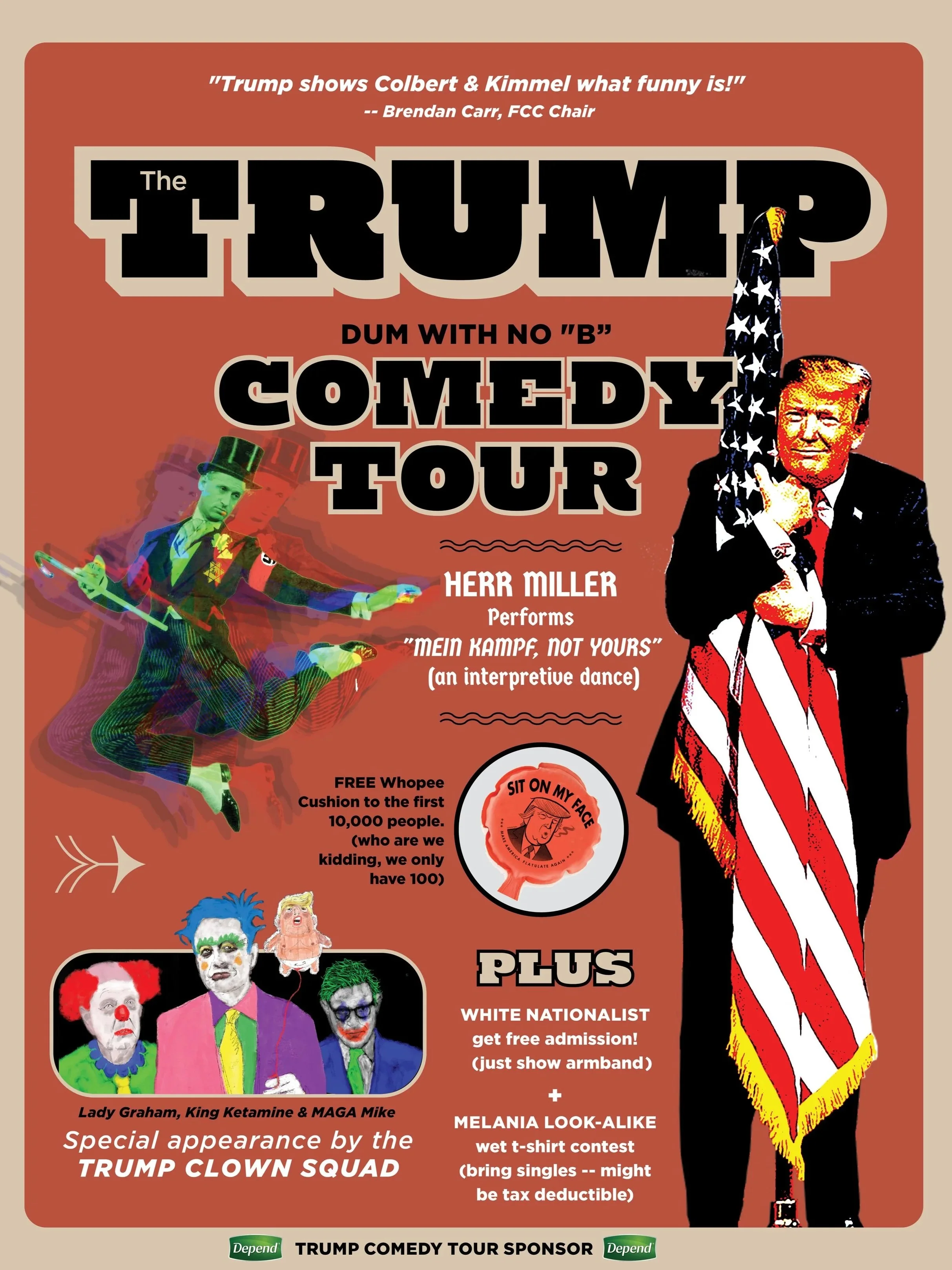
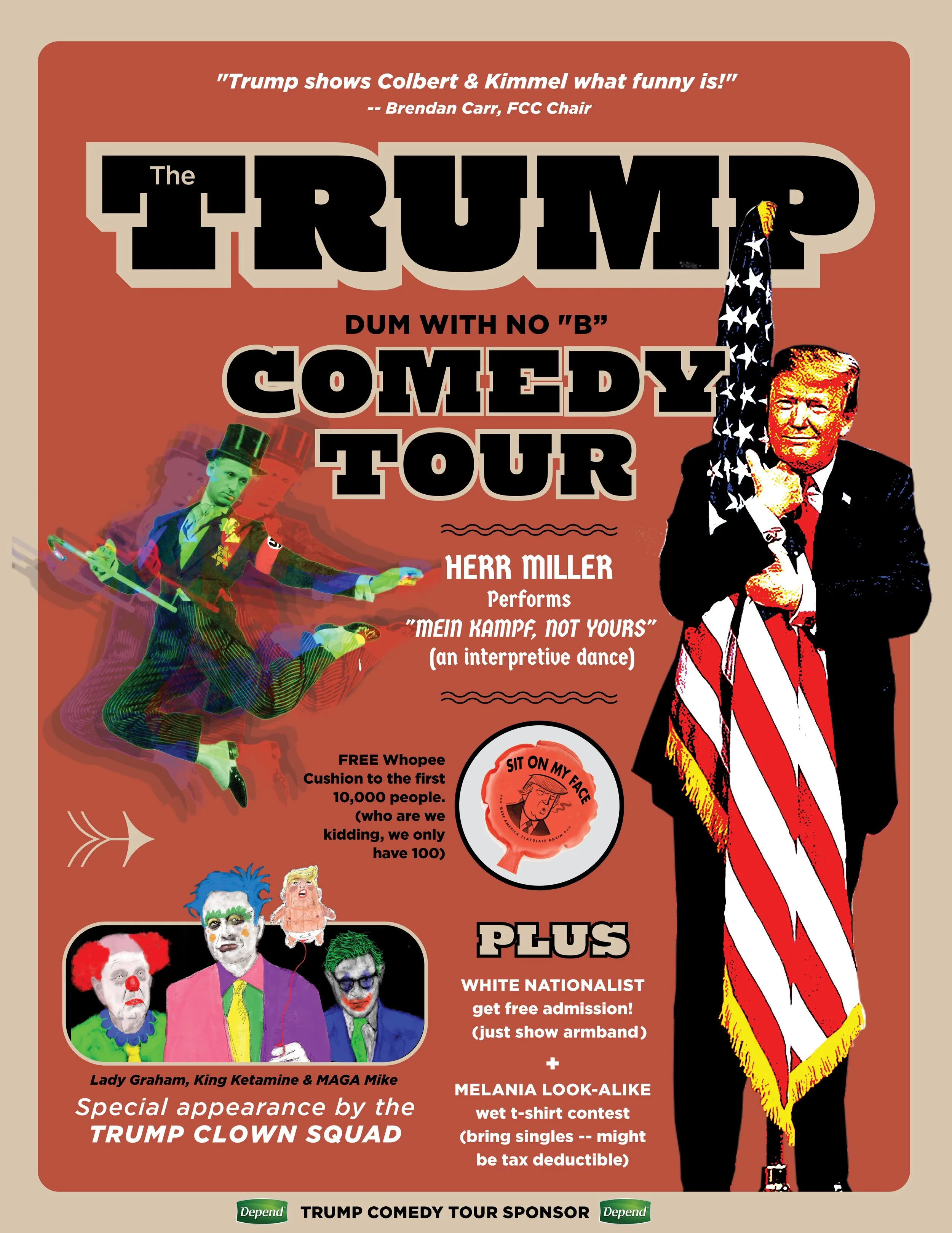
An idea I'd had in my head for years before I finally put it down. Take a sampling of Trump's actual comments and beliefs and drop them into an absurd setting, and the humor lands harder than just shrugging it off as "that's just Trump." Sometimes the best way to make a point is to let the subject make it for you.
Chicago Posters
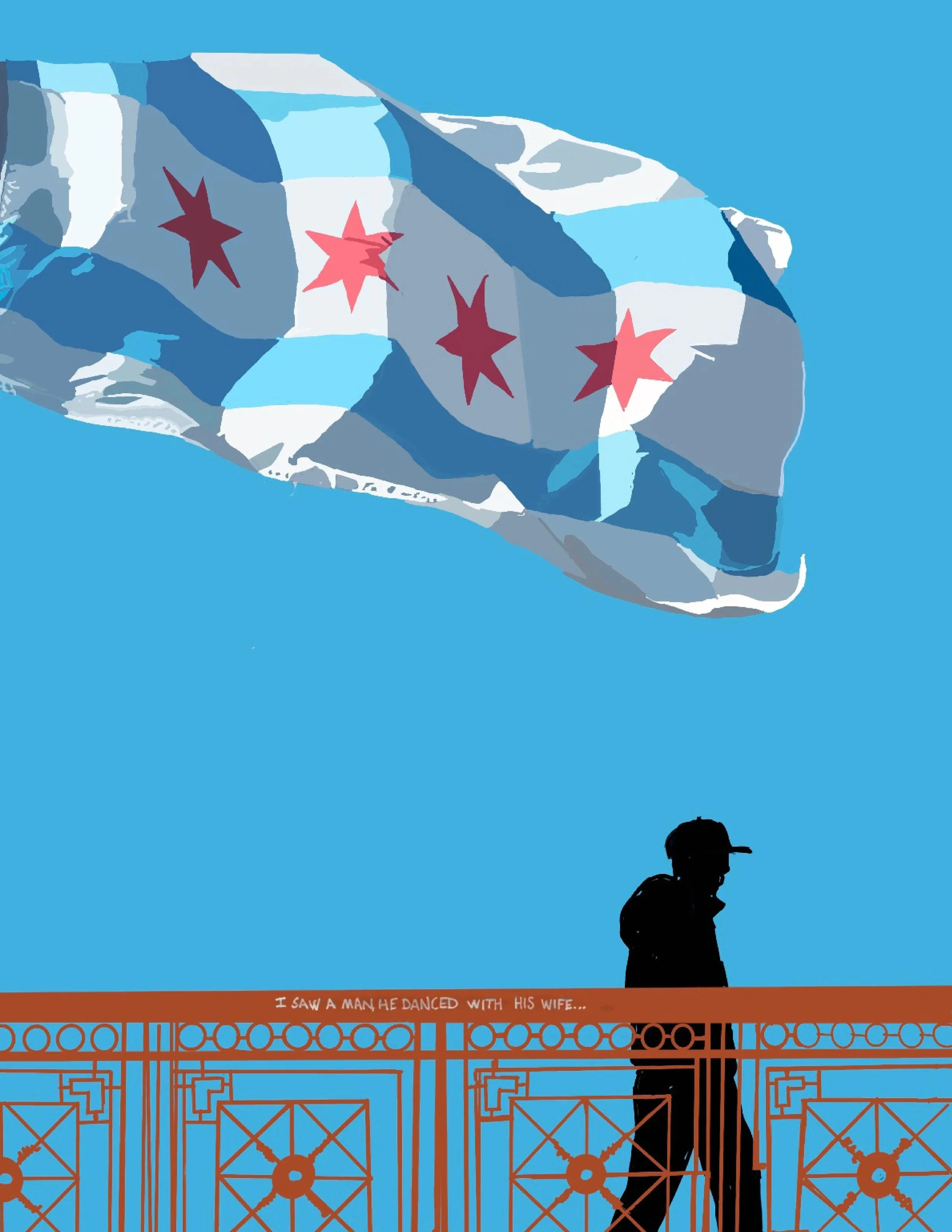
Chicago's flag might be the best-designed city flag in the country, and people who've never set foot here still recognize those four red stars on sight. This piece isn't trying to reinvent it — some symbols don't need reinventing, just a reason to look at them again.
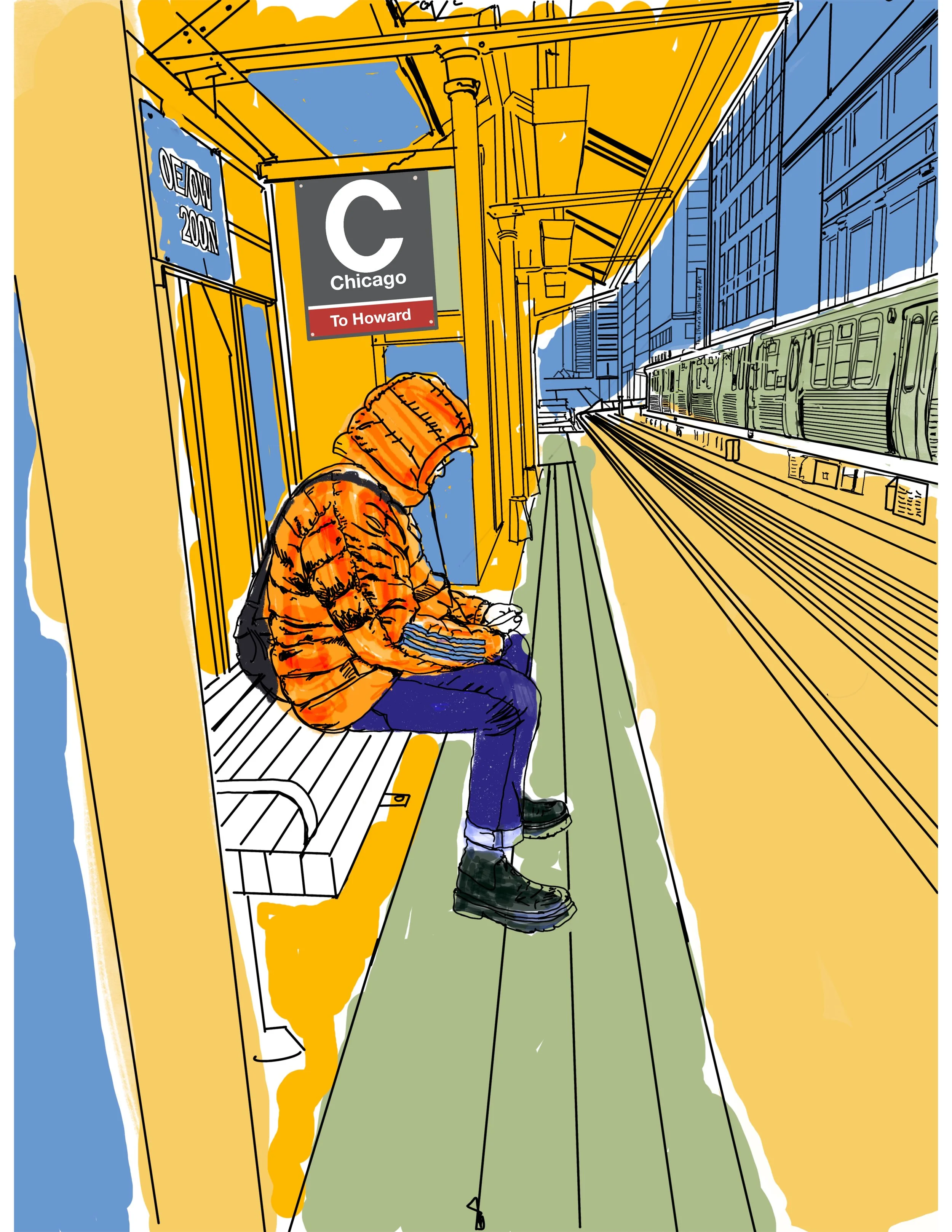
Not a landmark, not a tourist stop — just the specific, familiar misery of standing on an open-air EL platform in January, watching your breath while you wait for a train that's always three minutes further out than the app says. If you've done it, you'll recognize it instantly. If you haven't, this is basically what it feels like.
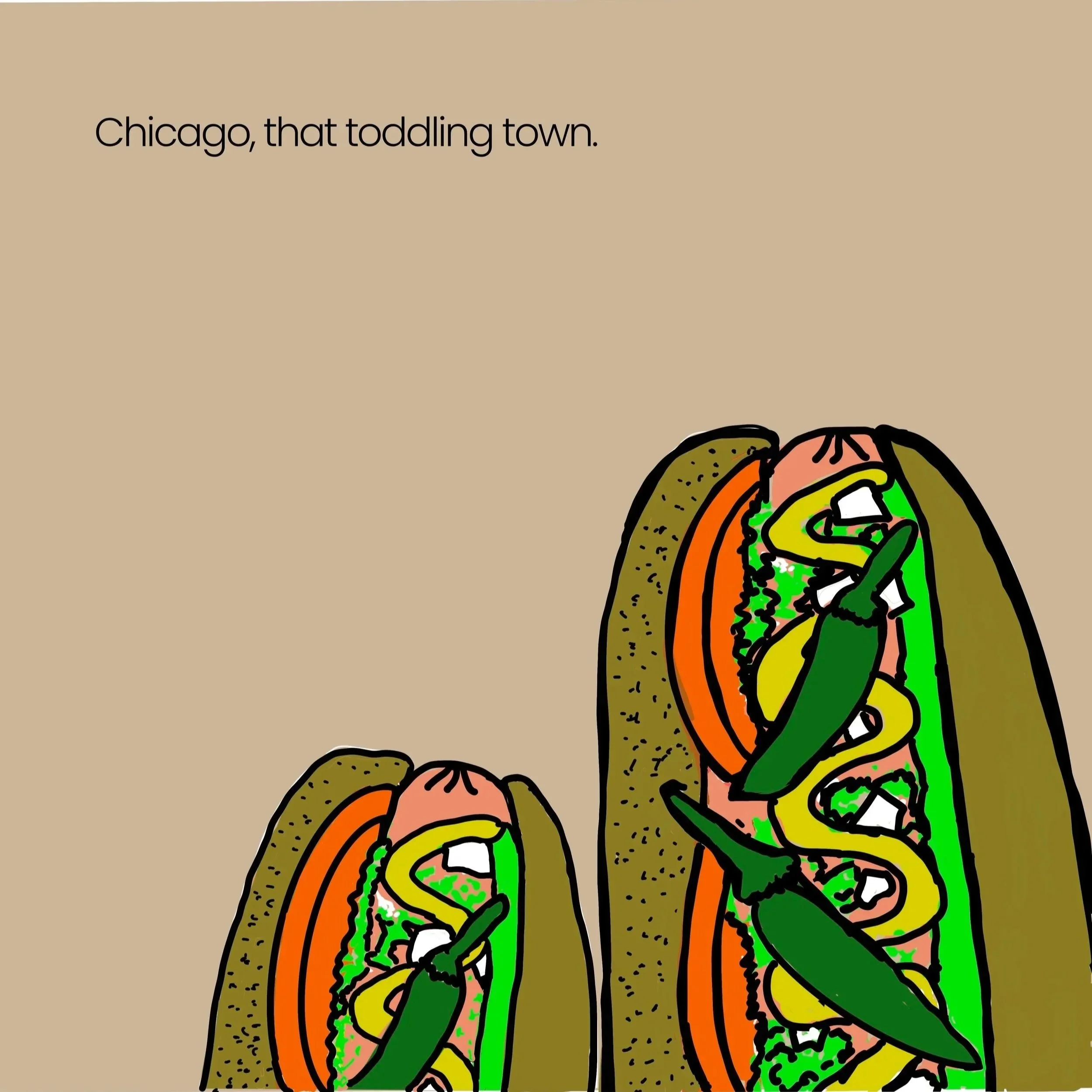
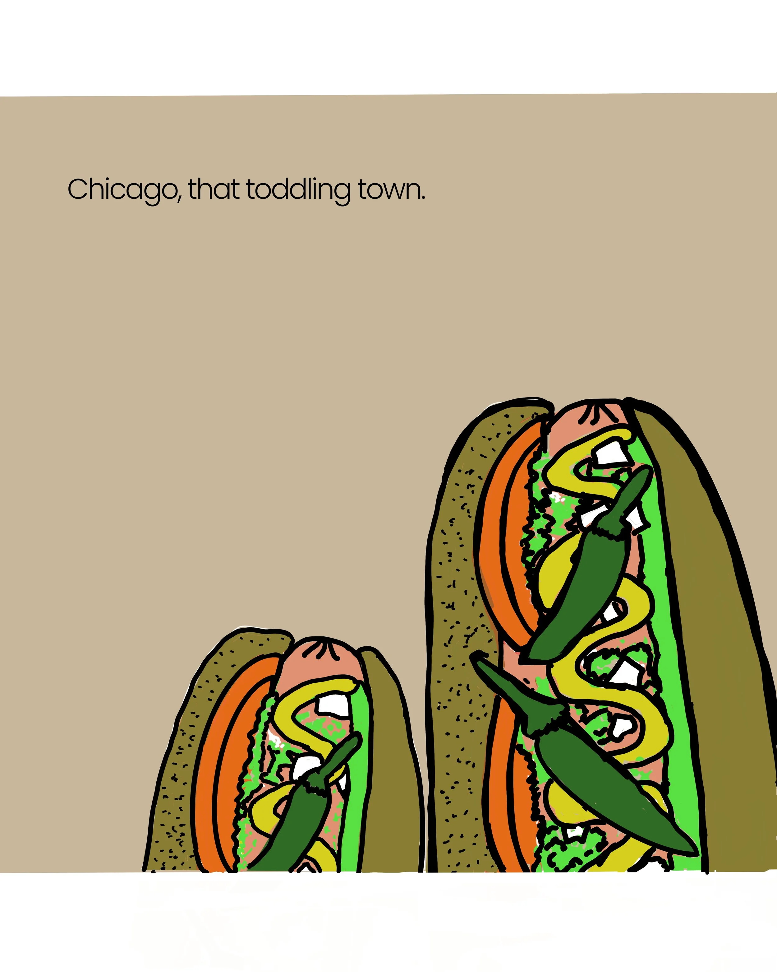
A play on the corn cob towers — Marina City — by way of Wilco's Yankee Hotel Foxtrot cover, which became one of the most recognizable album covers to come out of this city. Swapping the corn cobs for something more Chicago-on-Chicago felt right: a hometown landmark, filtered through a hometown band's most famous image.
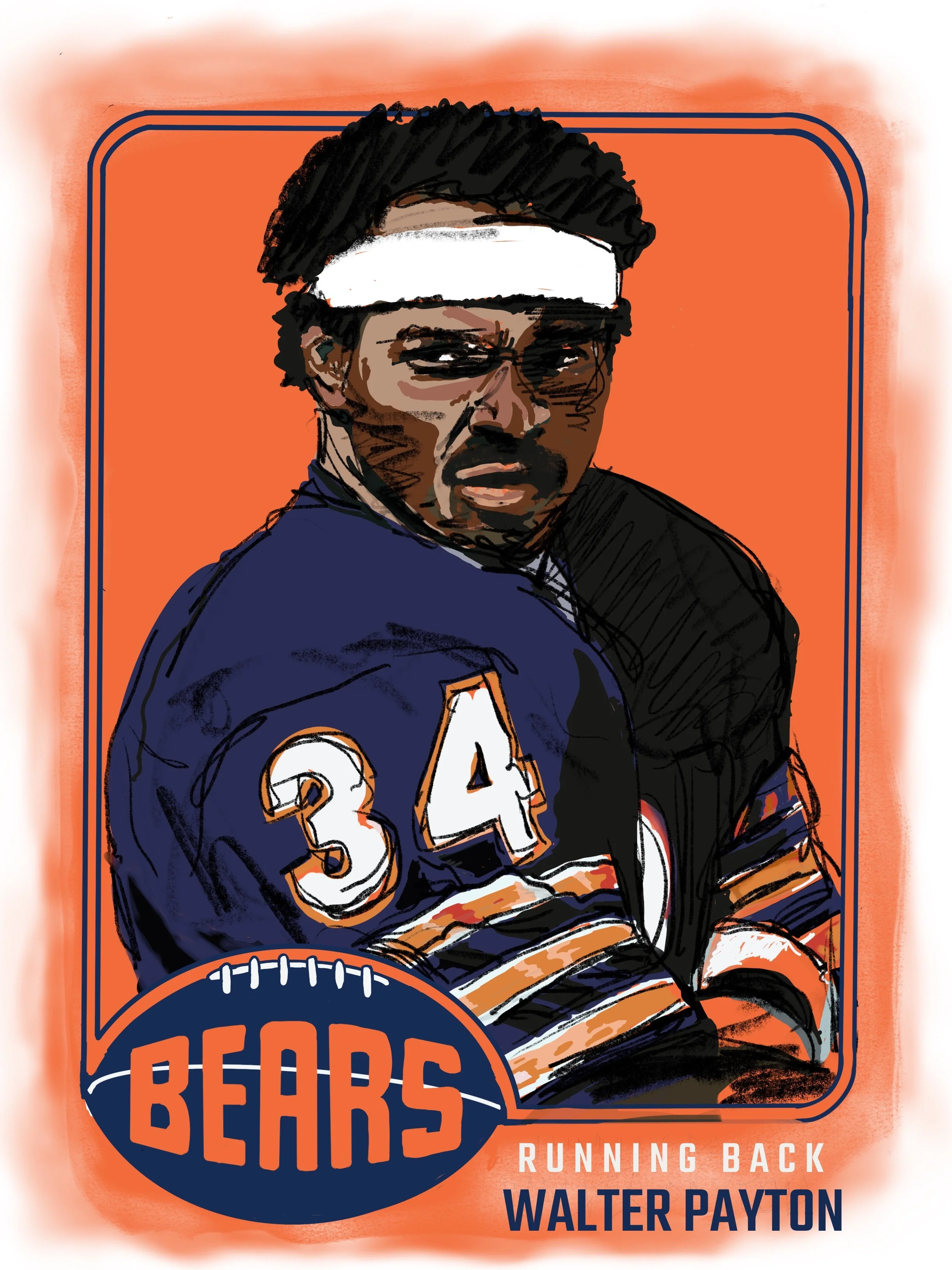
Sweetness. The most accomplished Bear to ever put on the uniform, and one of the most complete football players the position has produced — a runner who carried a franchise as much on effort and character as on yards. This one's less a highlight-reel piece and more a tribute piece; some subjects earn a different tone than the rest.
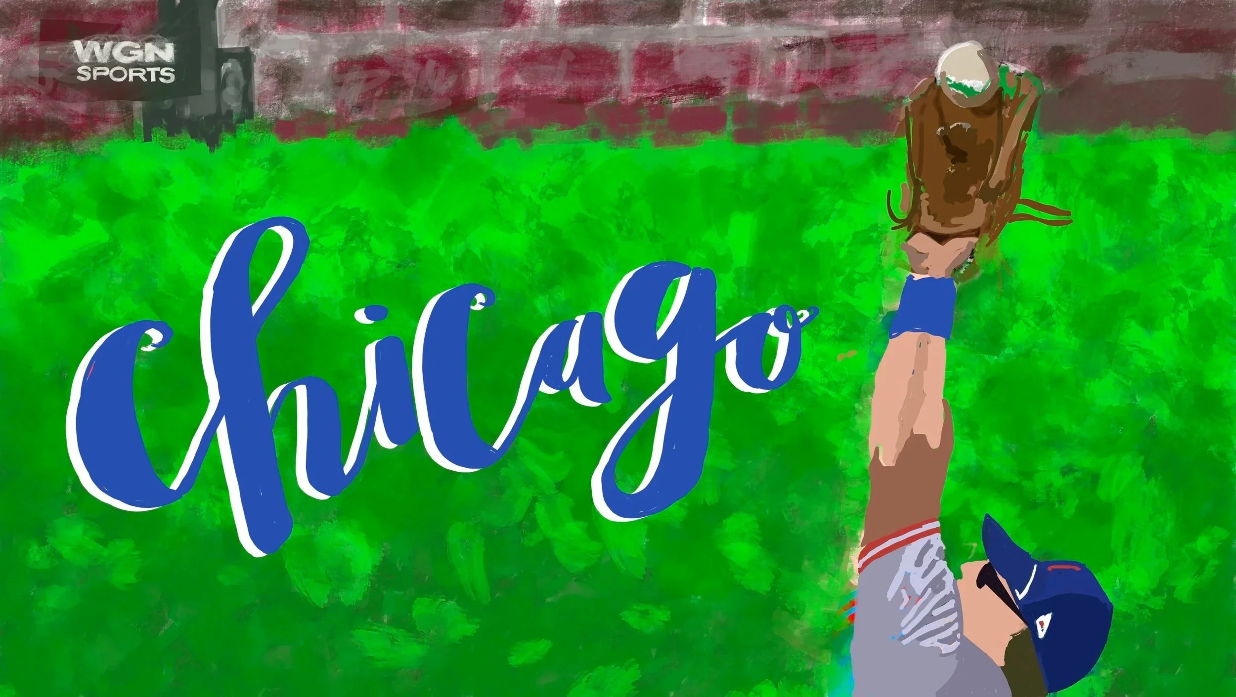
You can't talk about Chicago without talking about Wrigley, and you can't talk about Wrigley without talking about the ivy — a hand-planted outfield wall since 1937, mostly ignored until a ball disappears into it and an umpire has to make a judgment call. This piece is for the wall itself, not the stadium around it.
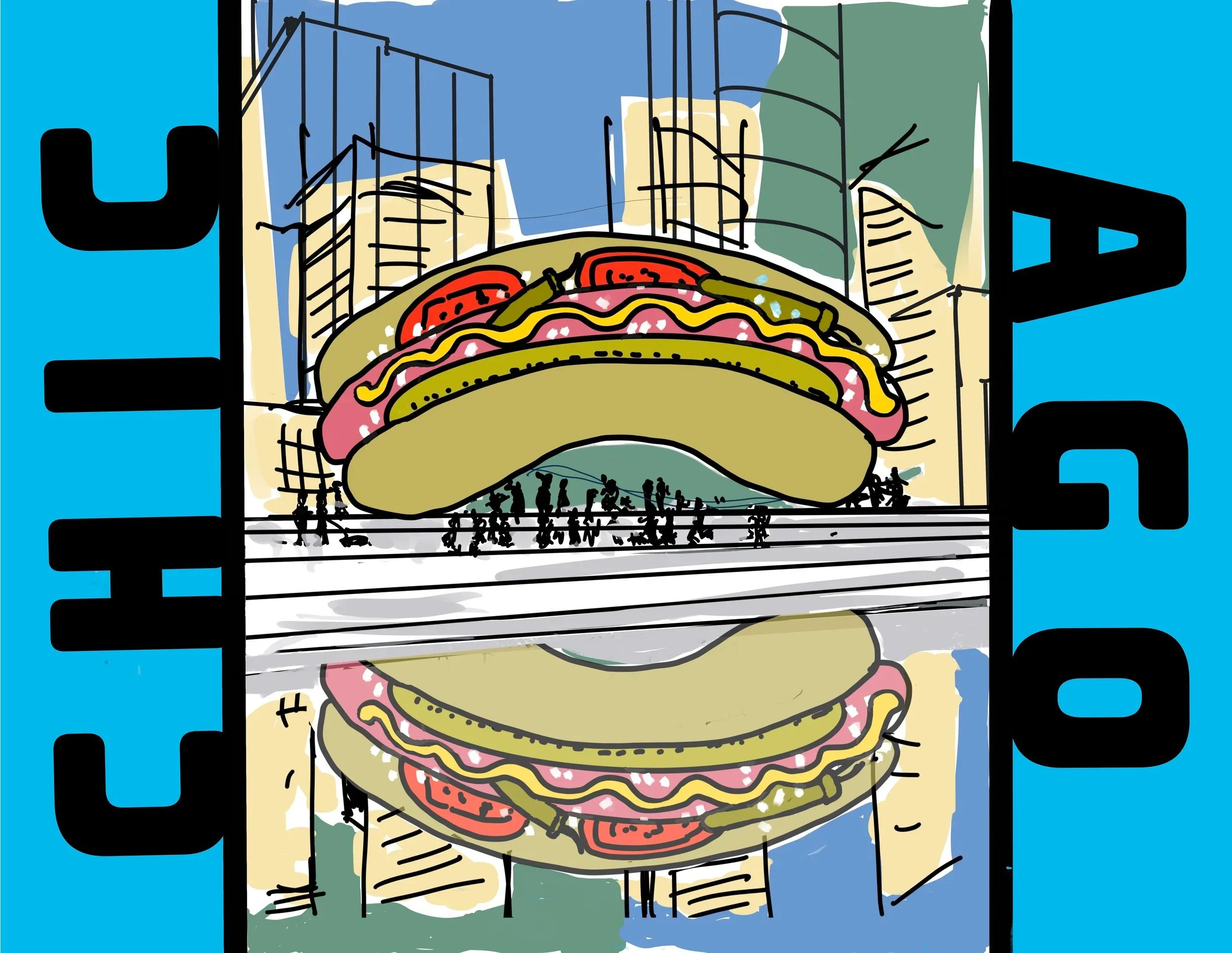
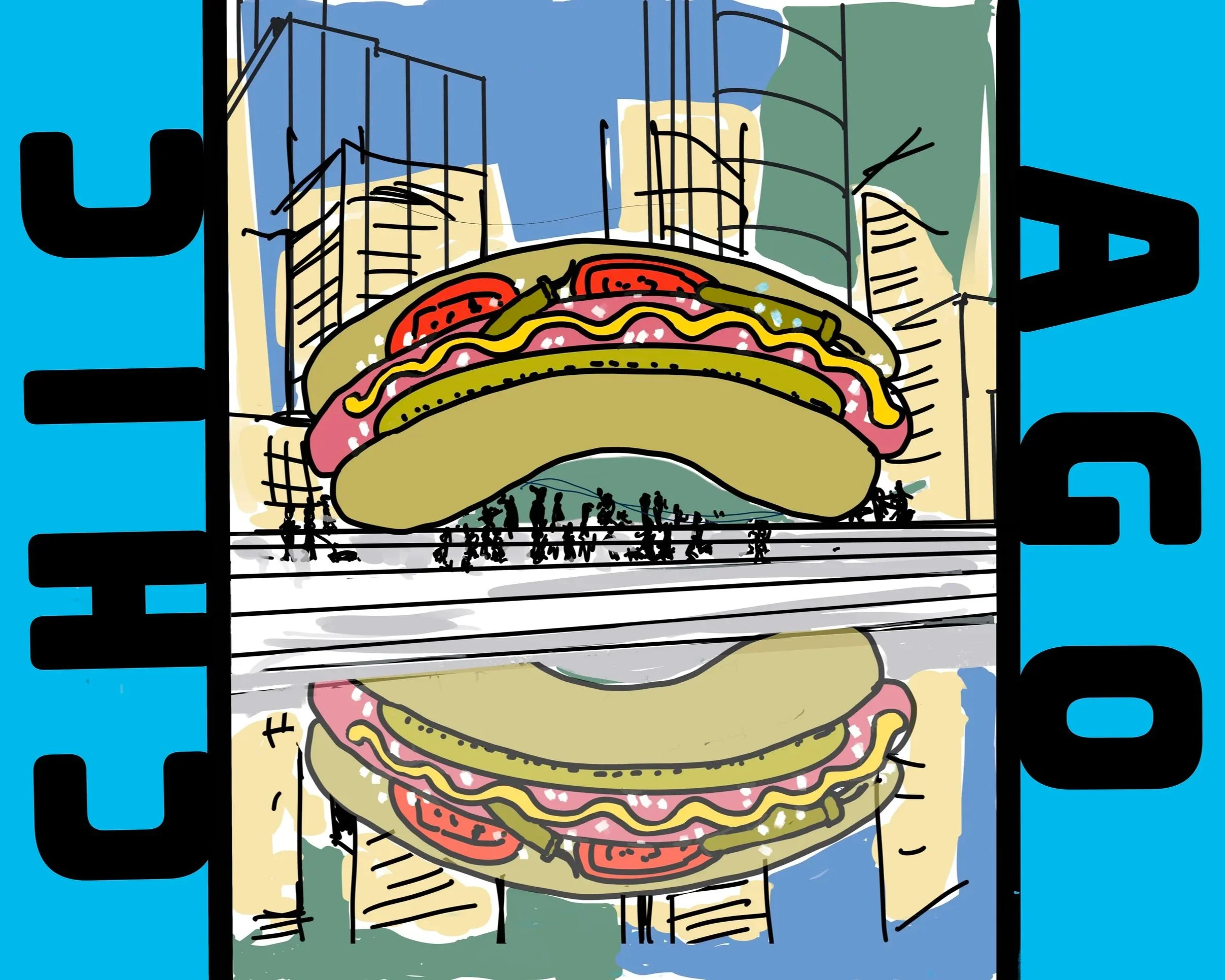
The Bean gets photographed more than almost anything else in the city and somehow still manages to say nothing about Chicago. So, I fixed that. Turning Millennium Park's most famous sculpture into a Chicago dog is the kind of joke this city would tell about itself — equal parts proud and self-deprecating.
“Art should be something that liberates your soul, provokes the imagination and encourages people to go further.” – Keith Haring
Pea’s Posters
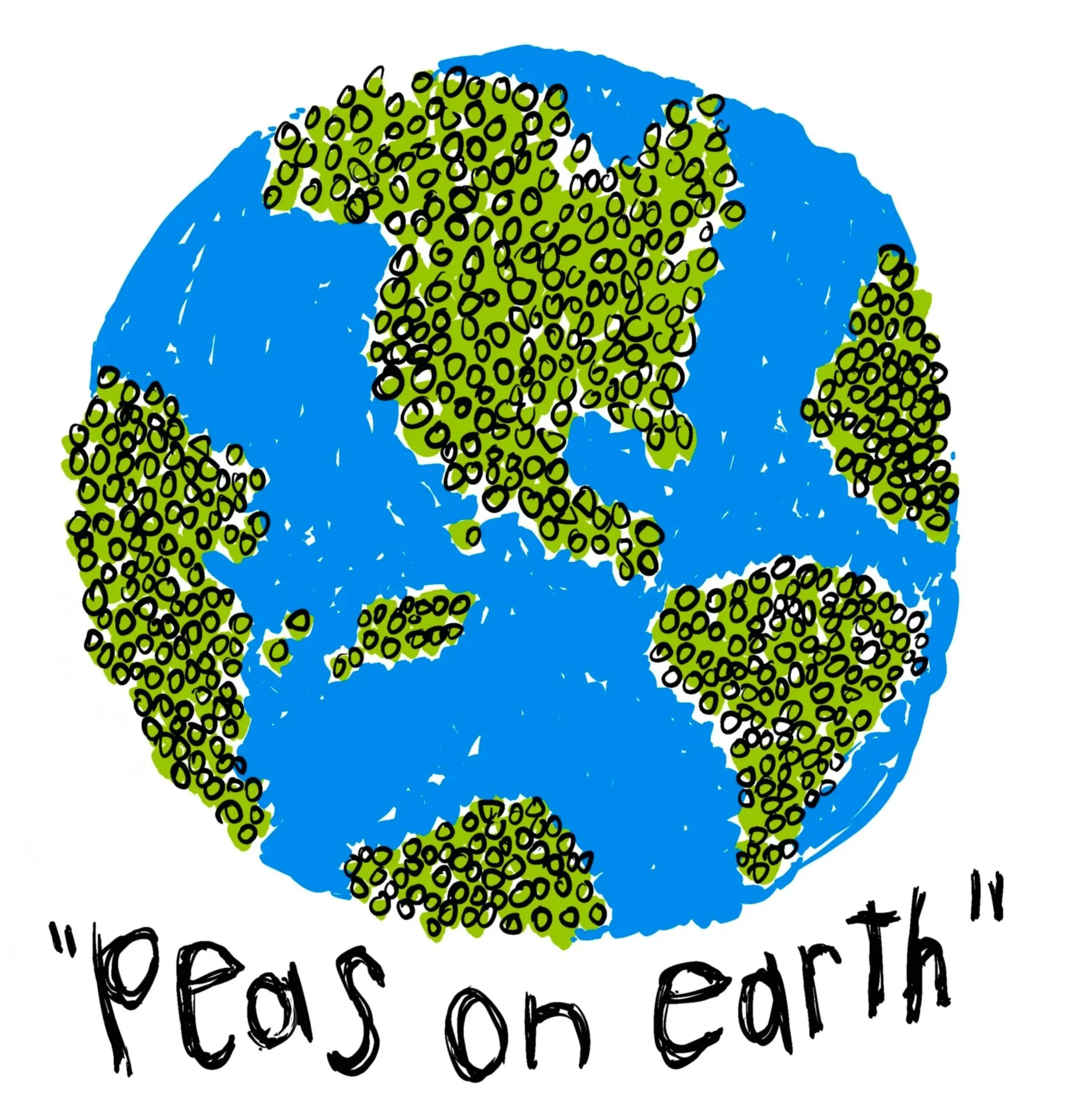
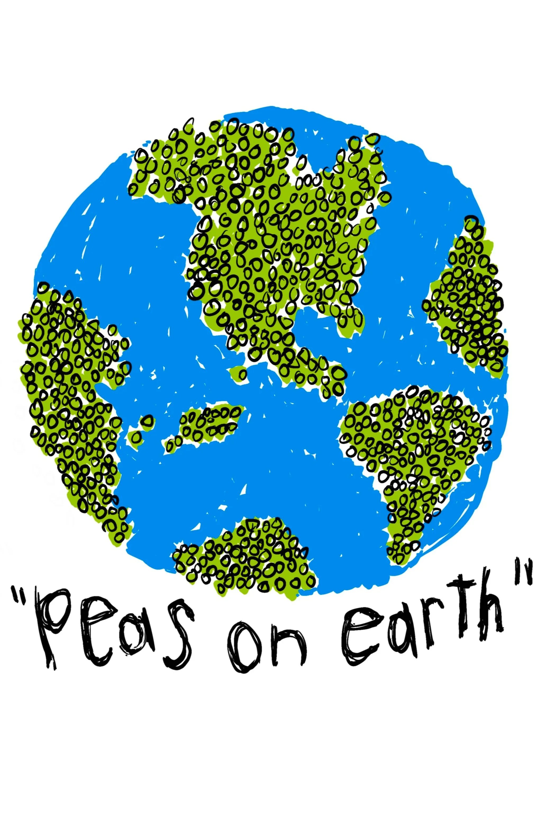
Part of the same original batch — a doodle that turned into a t-shirt, then a licensed mug design, then thirty years of sitting quietly before I decided it deserved a second act as a print. The pun's obvious. What's less obvious is that it's outlasted almost everything else I made around the same time.
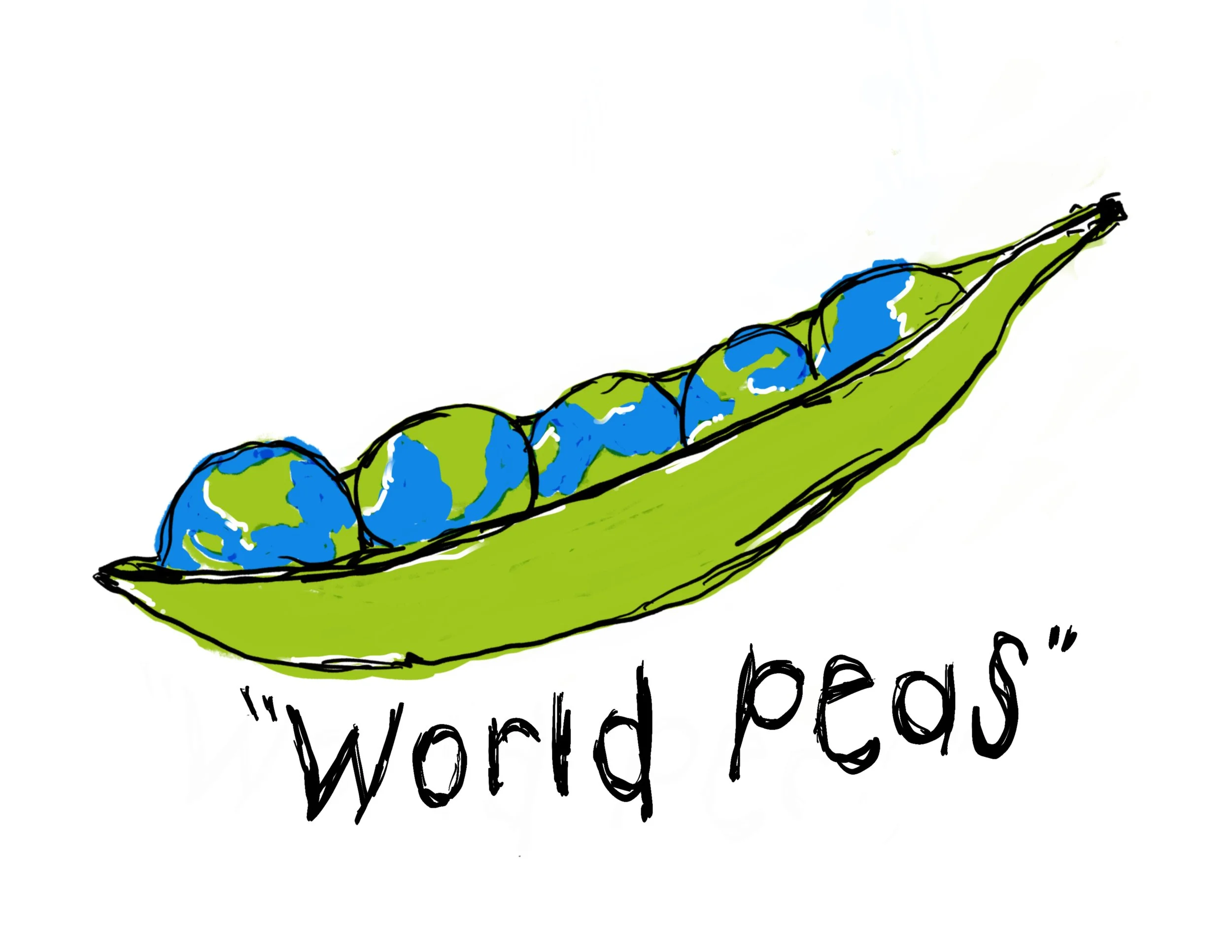
This design is older than the shop by about three decades. I came up with it on a whim, doodling while I was young and job-hunting, before I had any real plan for it. It started life on a t-shirt, got licensed to a mug company alongside a few siblings and sat dormant for thirty years before I brought it back and put it on paper. Some ideas are just built to outlast the moment they were made in.
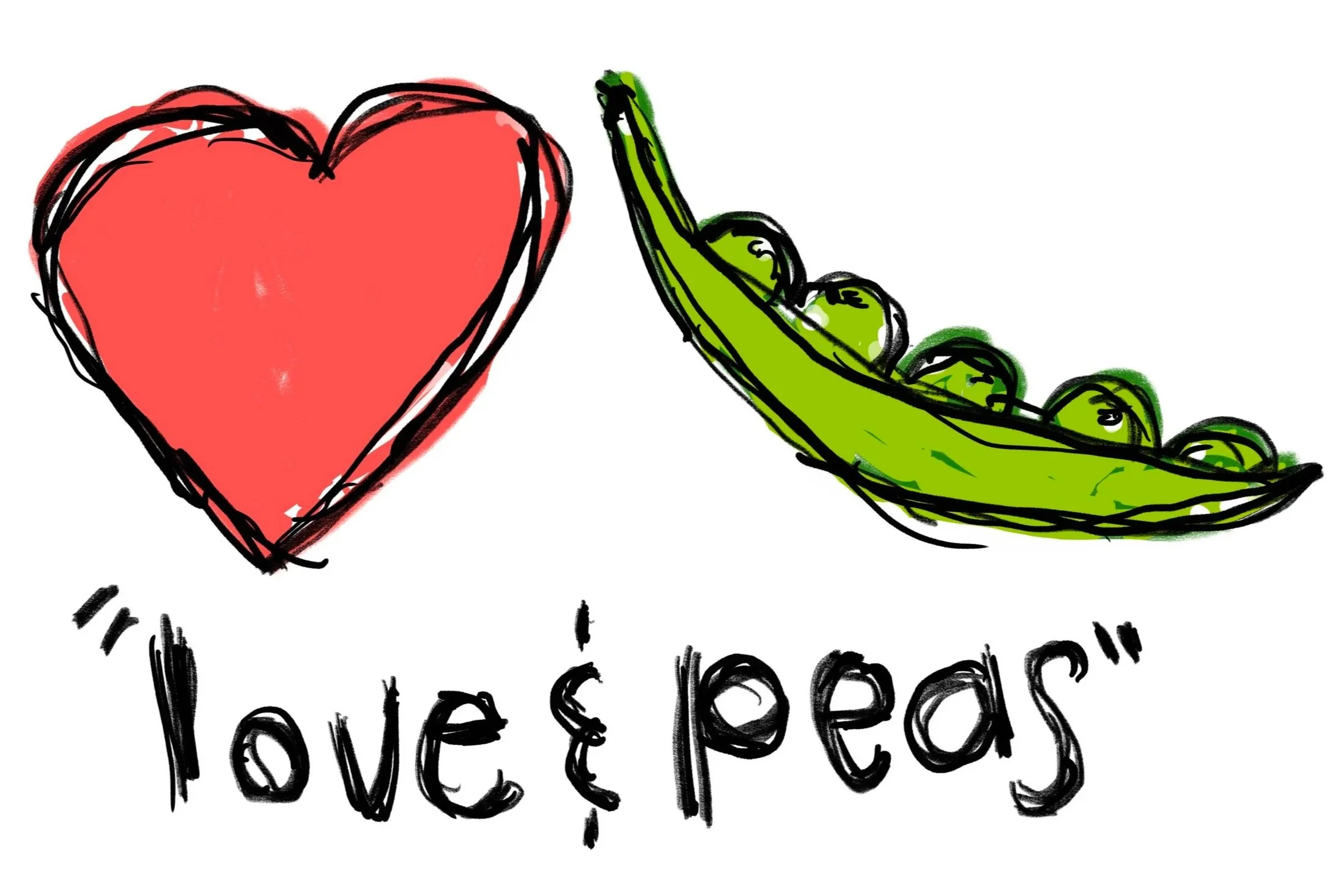
The third of the original run, and maybe my favorite of the three — simple enough that it should've been someone else's idea first, except it wasn't. It went from a shirt to a mug to thirty years of nothing, and now it's a poster. Turns out a good idea doesn't need to be used constantly to still be good.
Frame it. Hang it. Stare at it.
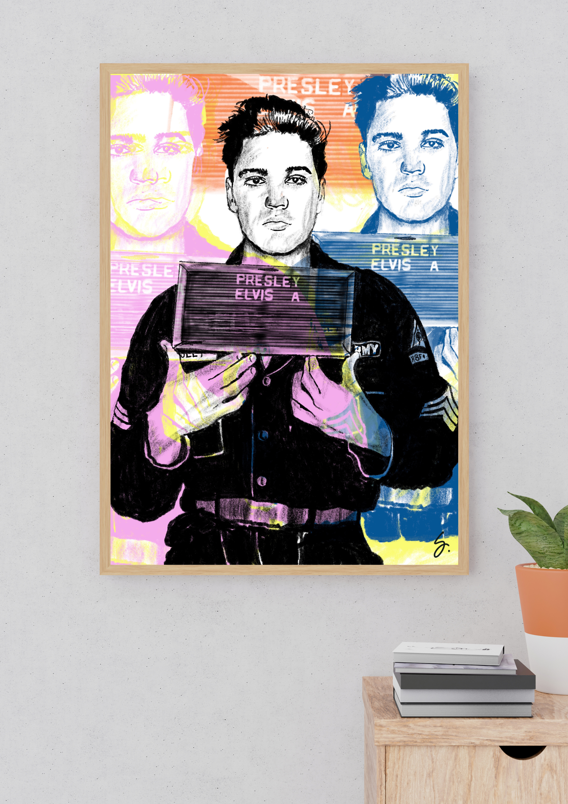
All posters are individually printed on 310g/m² archival-quality paper, on a high-precision 12-ink printer providing exceptional color depth and longevity. Plus, they're embossed and signed.
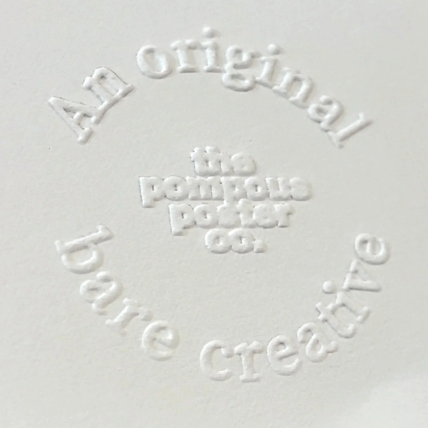
You know it’s an official Pompous Poster by our exclusive embossed stamp in the lower left hand corner.